Author: Dan Williford

  • Historical Books Gallery

    Historical Books Gallery

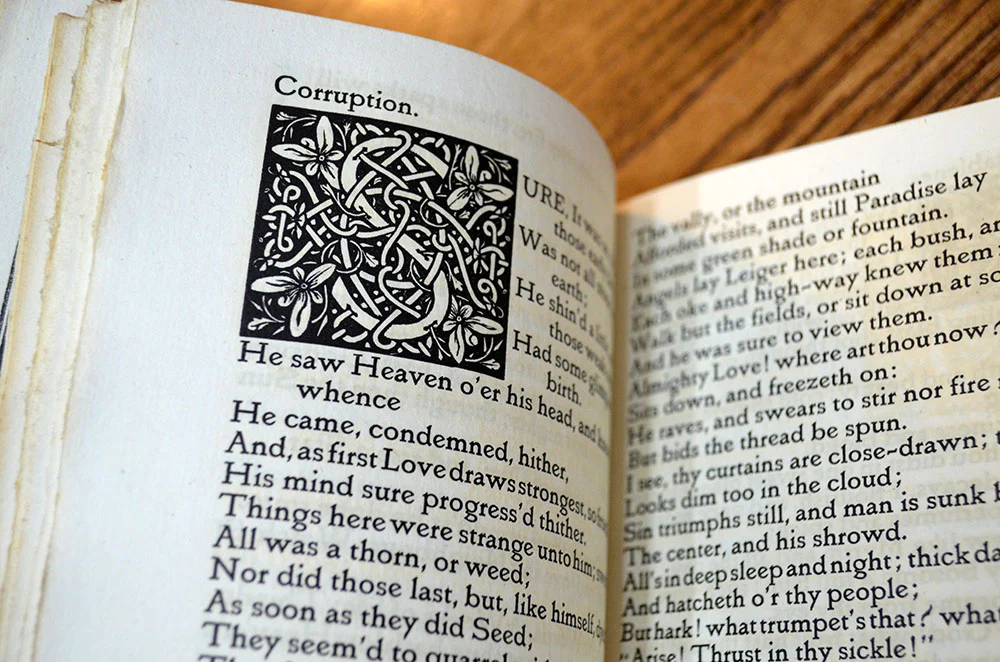
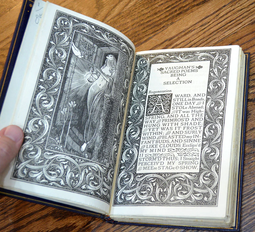
    Printing William Morris Emery Walker, 1894:

    “the invention of movable metal letters in the middle of the fifteenth century may justly be considered{112} as the invention of the art of printing. And it is worth mention in passing that, as an example of fine typography, the earliest book printed with movable types, the Gutenberg, or “forty-two line Bible” of about 1455, has never been surpassed.

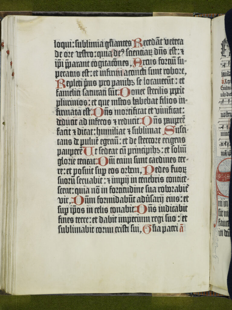
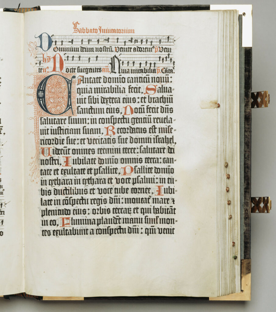
    And it was a matter of course that in the Middle Ages, when the craftsmen took care that beautiful form should always{113} be a part of their productions whatever they were, the forms of printed letters should be beautiful, and that their arrangement on the page should be reasonable and a help to the shapeliness of the letters themselves. The Middle Ages brought caligraphy to perfection, and it was natural therefore that the forms of printed letters should follow more or less closely those of the written character, and they followed them very closely. The first books were printed in black letter, i.e. the letter which was a Gothic development of the ancient Roman character, and which developed more completely and satisfactorily on the side of the “lower-case” than the capital letters; the “lower-case” being in fact invented in the early Middle Ages. The earliest book printed with movable type, the aforesaid Gutenberg Bible, is printed in letters which are an exact{114} imitation of the more formal ecclesiastical writing which obtained at that time; this has since been called “missal type,” and was in fact the kind of letter used in the many splendid missals, psalters, etc., produced by printing in the fifteenth century.

    But the first Bible actually dated (which also was printed at Maintz by Peter Schœffer in the year 1462) imitates a much freer hand, simpler, rounder, and less spiky, and therefore far pleasanter and easier to read. On the whole the type of this book may be considered the ne-plus-ultra of Gothic type, especially as regards the lower-case letters; and type very similar was used during the next fifteen or twenty years not only by Schœffer, but by printers in Strasburg, Basle, Paris, Lubeck, and other cities. But though on the whole, except in Italy, Gothic letter was most often used, a very few years saw the birth of Roman{115} character not only in Italy, but in Germany and France. In 1465 Sweynheim and Pannartz began printing in the monastery of Subiaco near Rome, and used an exceedingly beautiful type, which is indeed to look at a transition between Gothic and Roman, but which must certainly have come from the study of the twelfth or even the eleventh century MSS. They printed very few books in this type, three only; but in their very first books in Rome, beginning with the year 1468, they discarded this for a more completely Roman and far less beautiful letter. But about the same year Mentelin at Strasburg began to print in a type which is distinctly Roman; and the next year Gunther Zeiner at Augsburg followed suit; while in 1470 at Paris Udalric Gering and his associates turned out the first books printed in France, also in Roman{116} character. The Roman type of all these printers is similar in character, and is very simple and legible, and unaffectedly designed for use; but it is by no means without beauty. It must be said that it is in no way like the transition type of Subiaco, and though more Roman than that, yet scarcely more like the complete Roman type of the earliest printers of Rome.

    A further development of the Roman letter took place at Venice. John of Spires and his brother Vindelin, followed by Nicholas Jenson, began to print in that city, 1469, 1470; their type is on the lines of the German and French rather than of the Roman printers. Of Jenson it must be said that he carried the development of Roman type as far as it can go: his letter is admirably clear and regular, but at least as beautiful as any other Roman type. After his{117} death in the “fourteen eighties,” or at least by 1490, printing in Venice had declined very much; and though the famous family of Aldus restored its technical excellence, rejecting battered letters, and paying great attention to the “press work” or actual process of printing, yet their type is artistically on a much lower level than Jenson’s, and in fact they must be considered to have ended the age of fine printing in Italy.

    Jenson, however, had many contemporaries who used beautiful type, some of which—as, e.g., that of Jacobus Rubeus or Jacques le Rouge—is scarcely distinguishable from his. It was these great Venetian printers, together with their brethren of Rome, Milan, Parma, and one or two other cities, who produced the splendid editions of the Classics, which are one of the great glories of the printer’s art, and are{118} worthy representatives of the eager enthusiasm for the revived learning of that epoch. By far the greater part of these Italian printers, it should be mentioned, were Germans or Frenchmen, working under the influence of Italian opinion and aims.

    It must be understood that through the whole of the fifteenth and the first quarter of the sixteenth centuries the Roman letter was used side by side with the Gothic. Even in Italy most of the theological and law books were printed in Gothic letter, which was generally more formally Gothic than the printing of the German workmen, many of whose types, indeed, like that of the Subiaco works, are of a transitional character. This was notably the case with the early works printed at Ulm, and in a somewhat lesser degree at Augsburg. In fact Gunther Zeiner’s first type{119} (afterwards used by Schussler) is remarkably like the type of the before-mentioned Subiaco books.

    The characteristic Dutch type, as represented by the excellent printer Gerard Leew, is very pronounced and uncompromising Gothic. This type was introduced into England by Wynkyn de Worde, Caxton’s successor, and was used there with very little variation all through the sixteenth and seventeenth centuries, and indeed into the eighteenth. Most of Caxton’s own types are of an earlier character, though they also much resemble Flemish or Cologne letter. After the end of the fifteenth century the degradation of printing, especially in Germany and Italy, went on apace; and by the end of the sixteenth century there was no{120} really beautiful printing done”

    Note by William Morris on his Aims in Founding The Kelmscott Press

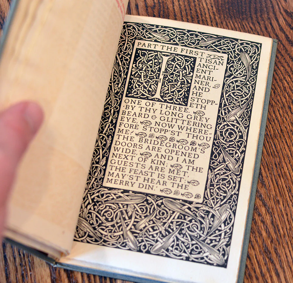
    I have always been a great admirer of the calligraphy of the Middle Ages, and of the earler printing which took its place. I had noticed that they were always beautiful by force of the mere typography, even without the added ornament, which which many of them are so lavishly supplied.

    There was only one source from which to take examples of this perfected Roman type, to wit, the works of the great Venetian printers of the fifteenth century, of whom Nicholas Jenson produced the completest and most Roman characters from 1470 to 1476. …I did not copy it serviley; in fact, my Roman type, especially in the lower case, tends rather more to the Gothic than does Jenson’s.

    I felt that htis charge could nto be reasonably brought against the types of the first two decades of printing: that Schoeffer at Mainz, Mentelin at Strasburg, and Gunther Zainer at Augsburg…

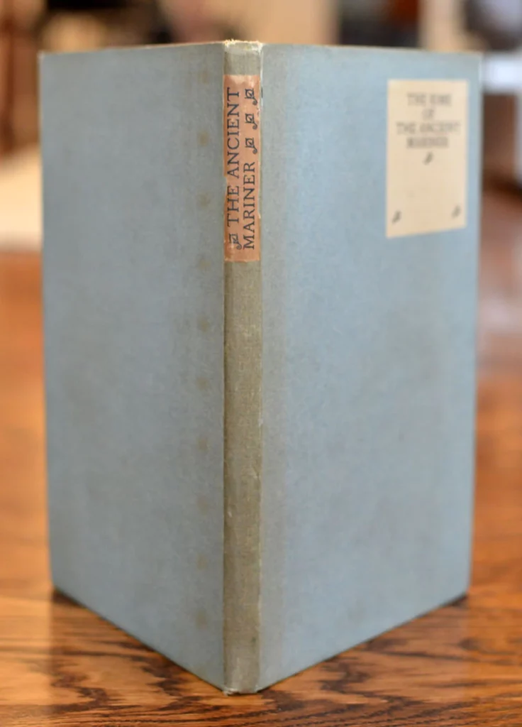
    History of the Kelmscott

    …He now bought with the definite purpose of studying the type and methods of early printers. Among the first books so acquired was a copy of Leonardo of Arezzo’s History of Florence, printed at Venice by Jacobus RUbeus in 1476, in a Roman type very similar to that of Nicholas Jenson. Part sof this book and of Jensons’ Pliny of 1476 were enlarged by photography [11]…

    The troy type, which its designer preferred to either of the others, shows the influence of the beautiful early types of Peter Schoeffer of Mainz, Gunterh Zainer of Augsburg, and Anthony Konburger of Nuremberg; but even more than the Golden type, it has a strong character of its own, which differs largely from taht of any mediaeval fount. [13]

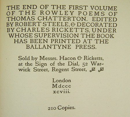
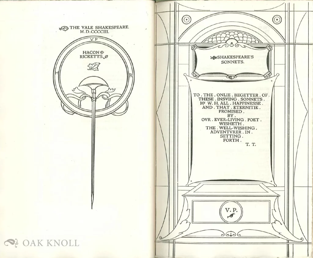
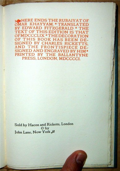
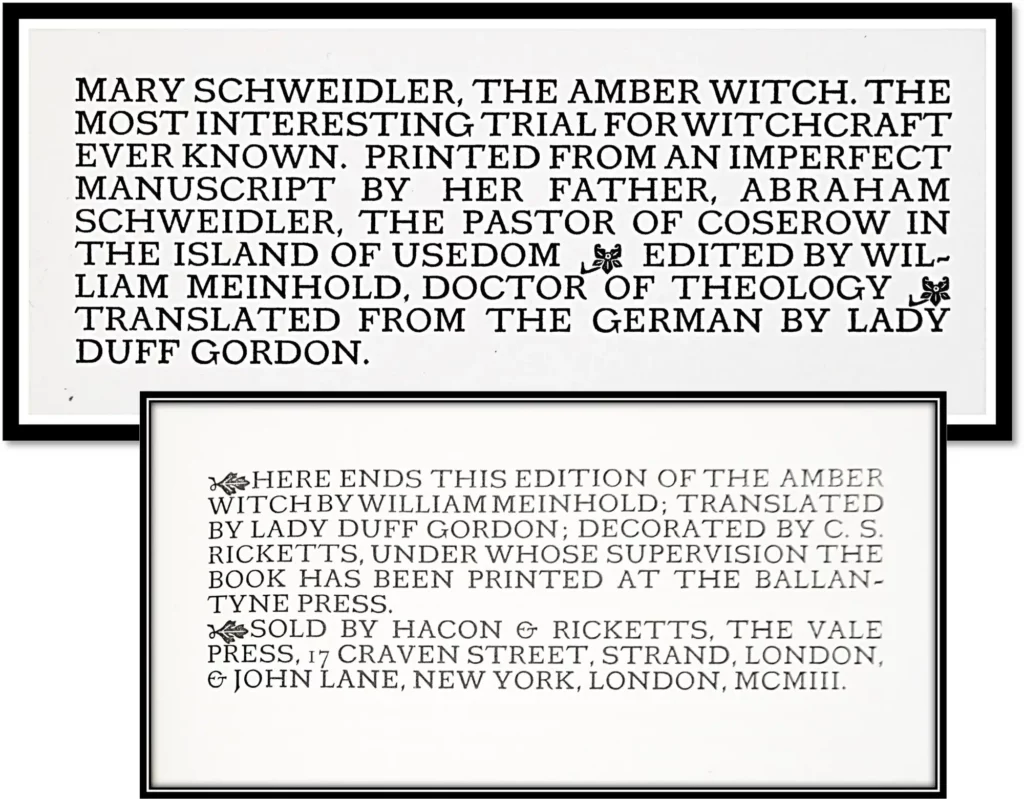
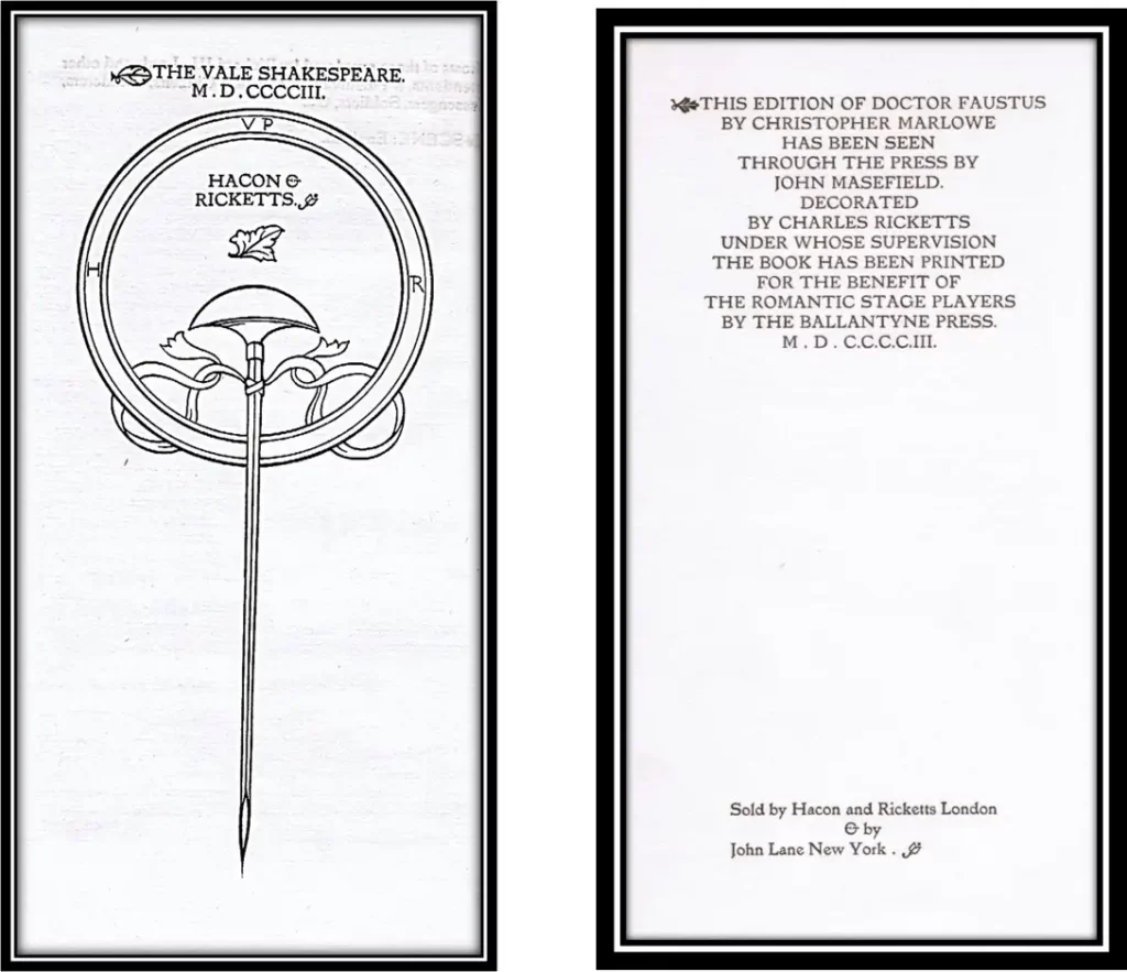
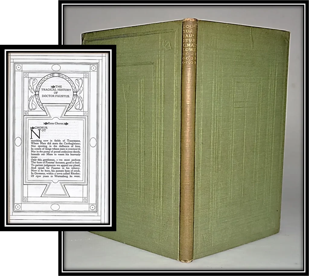
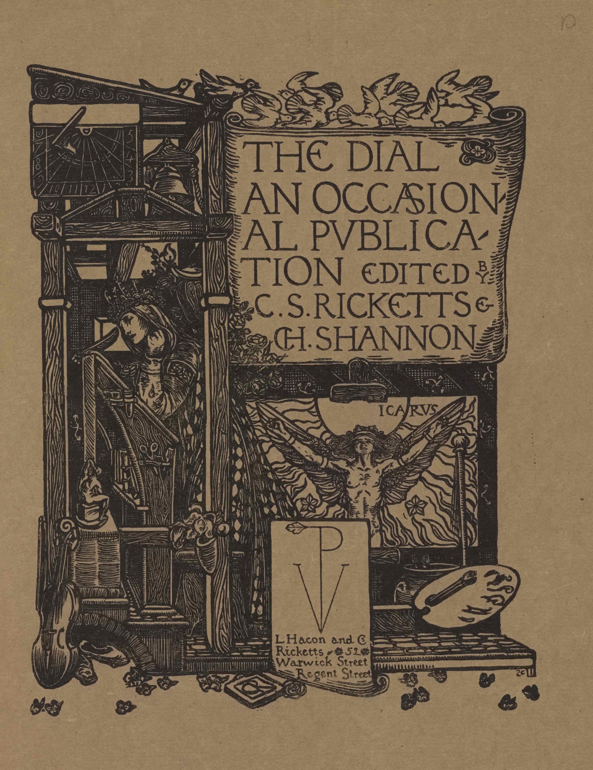
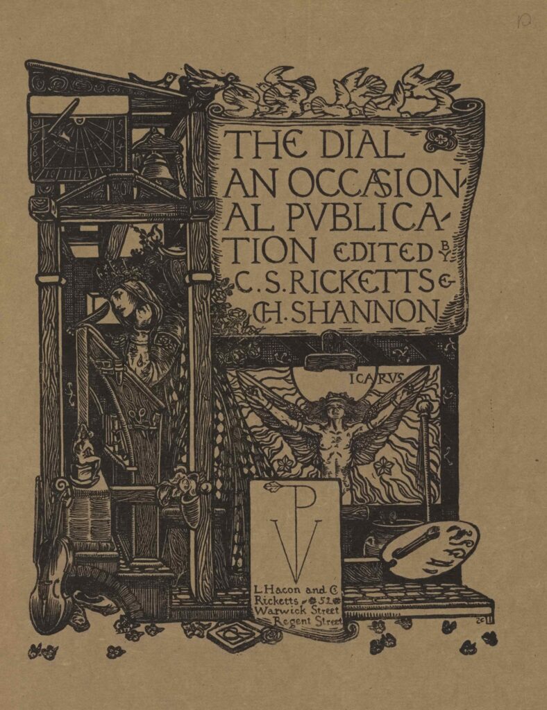
    Bibliography of Hacon and Ricketts

    therein lies their affinity with the grand volumes of the Italian and German presses (viii)

    It is well known, or should be well known, that the Roman letters we use currently were “crystalised” into their present shape by the early Italian printers in their attempt to hark back to the “pre-Gothic,” i.e., the Carolingian minuscules, in which they recognised the survival of the old classical alphabet, and the roots or essential forms of the letters upon which the Gothic scribes had grafted their compressions and ornamental details. (x-xi).

    “…the charm of the early designers of roman type, J. Spira and Jenson, for instance, lies in that sense of logic, balance, and control which characterised the Renaissance itself, not to any unconscious survival of picturesque Gothic penmanship. The secret of success of the finest Renaissance founts lies in the fact that they contain the first personal and forcible revision of those letter forms by men who were passionately in earnest, in a period which was also passionately in earnest.” (xi)

    I would therefore urge that all attempts to remould our alphabet should be based on a study of the Carolingian minuscules, revised and recast. (xi-xii)

    The origin of our Roman alphabet dates from the penmanship of the 9th century. …This led to the supplanting of the uncial forms by the half-uncial in the lower case, the capitals retaining the old uncial character. (xii)

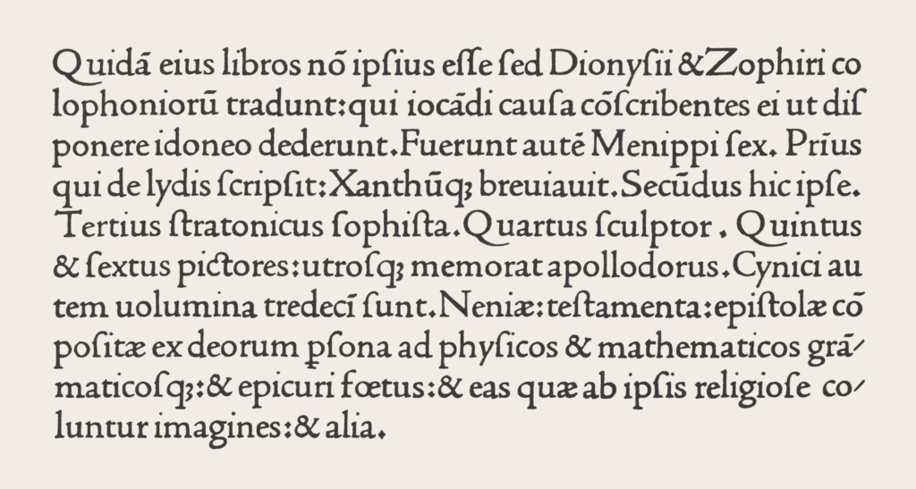
    One of the elements of the success of Jenson’s famous fount lies precisely in this harmonious quality, in that it is admirable as type: though I dare venture that individual letters are not always equal in beauty of shape to the fount of John Spira (whose design served probably as a model) or even to other Italian founts. (xv)

    A Defense of the Revival of Printing, Ricketts

    That trained scribes of the fifteenth century were called in to design type, and that the efforts to recast the Carlovingian writing of the ninth and tenth centuries benefitted by their practice with the pen, is conceivable enough, but conjecture ends here, for penmanship was not of the highest quality at the end of the fifteenth century. A student of form must study elsewhere (as the old type designers did) to note at what period shape reaches its perfection. (5)

    In the history of the finer Italian printers we may almost date certain founts by the still surviving traces of penmanship, that Jenson will discard for practical reasons. With Sweynheym and Pannartz, Hahn, and Spira, the body of the “h” curves in graceully… With Jenson, revising the work of Spira, these letters “h,” “n,” “m,” become what they are to-day. (6)

    Spira is often his superior (7)

    Capitals: “if from Jenson to Aldus (in the fine type of the “Poliphilus”) there is a general deterioration; in that matter of the Capitals only there is perhaps a progress (9)

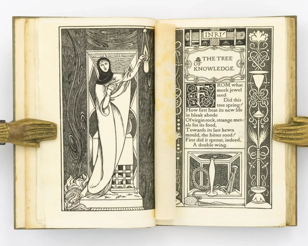
    “for our purpose the art of letter making reached its climax before the full development of mediaeval Art, and the evolving of the subsequent ornamental manner of writing known as Gothic.

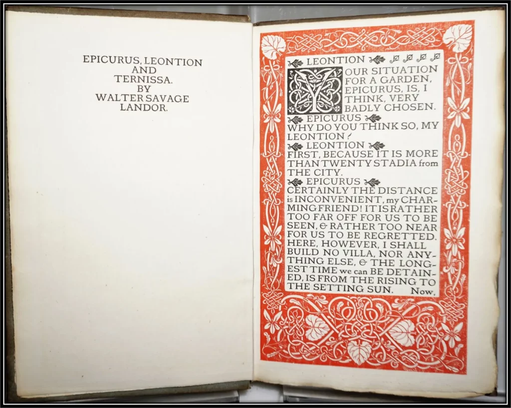
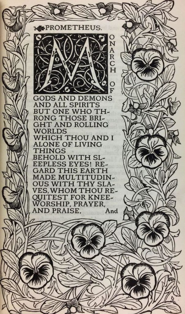
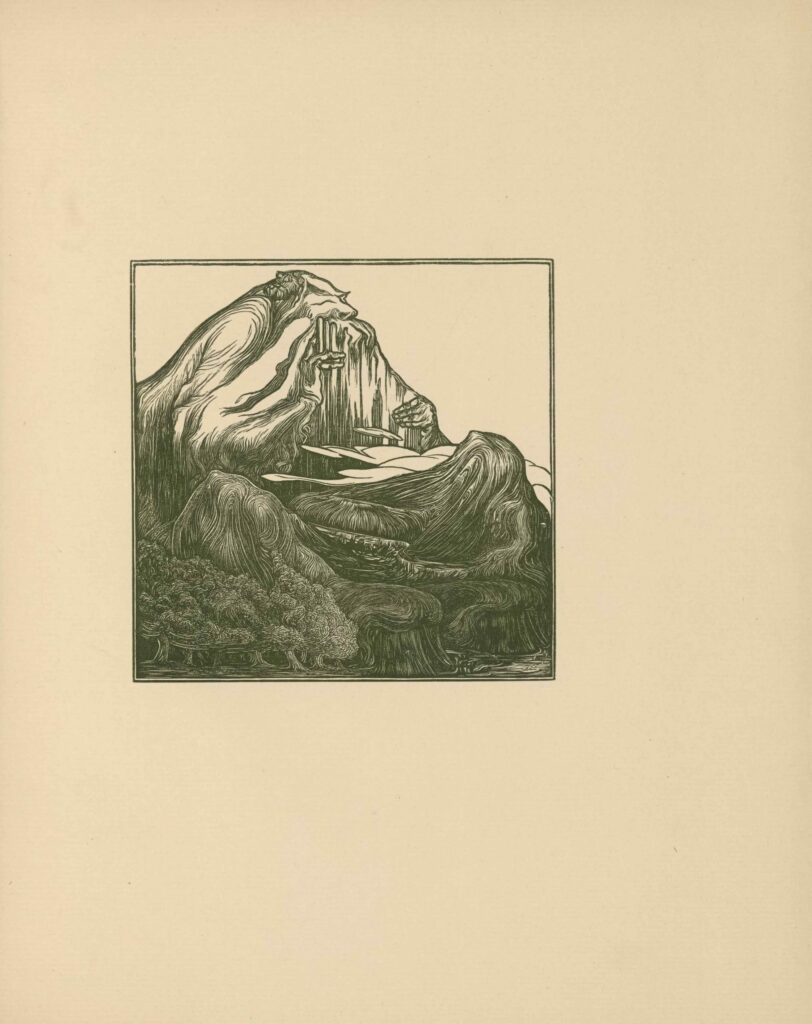
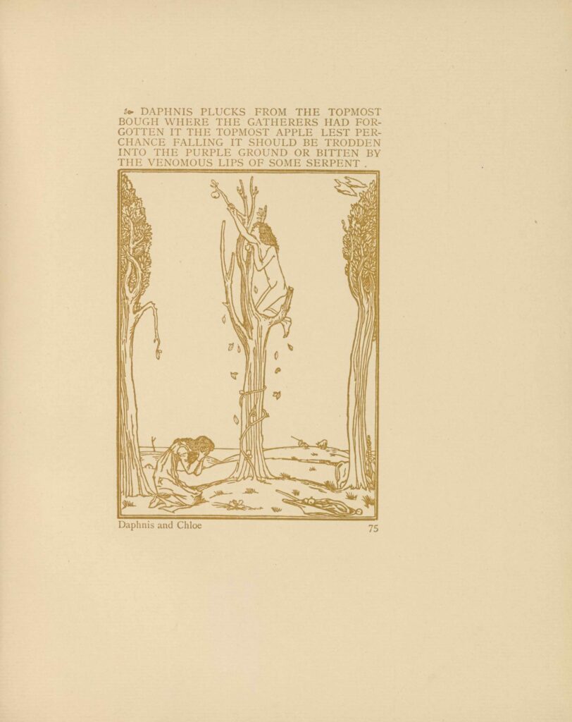
    I was by that time, as I am still, utterly won over and fascinated by the sunny pages of the Venetian printers: I would define the page of a fine Kelmscott book as full of wine, and Italian book as full of light.” 19 [Daphnis and Chloe]

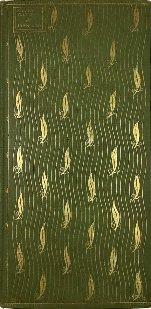
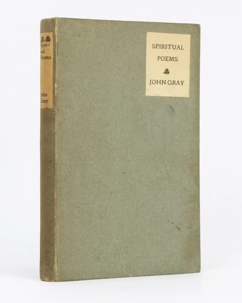
    “Still showing the Italian influence, though, like another book I shall hereafter mention…I would mention Mr. J Gray’s “Silverpoints.” The model of this book was one of those rare Aldus italic volumes with its margins uncut.” (20-21)

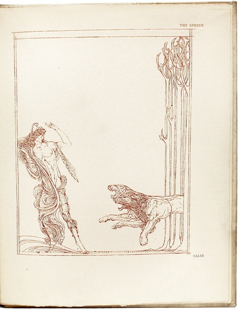
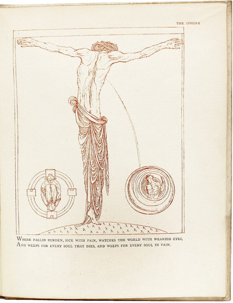
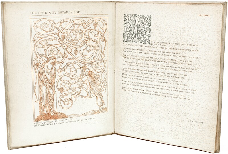
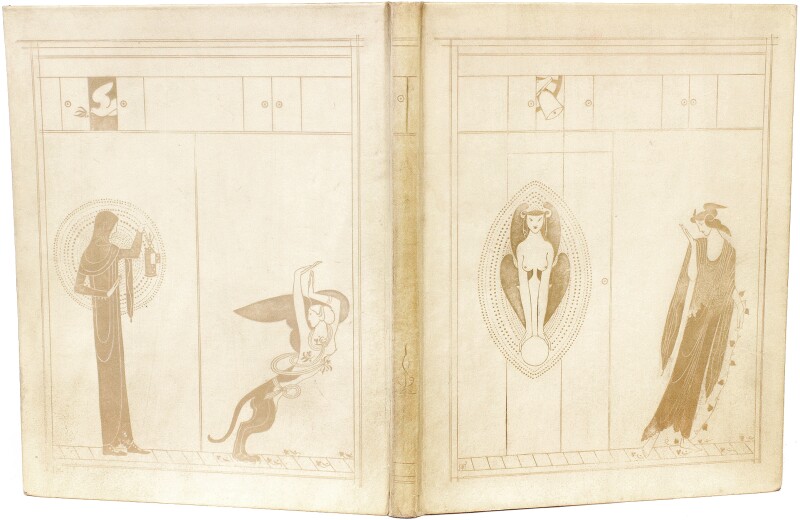
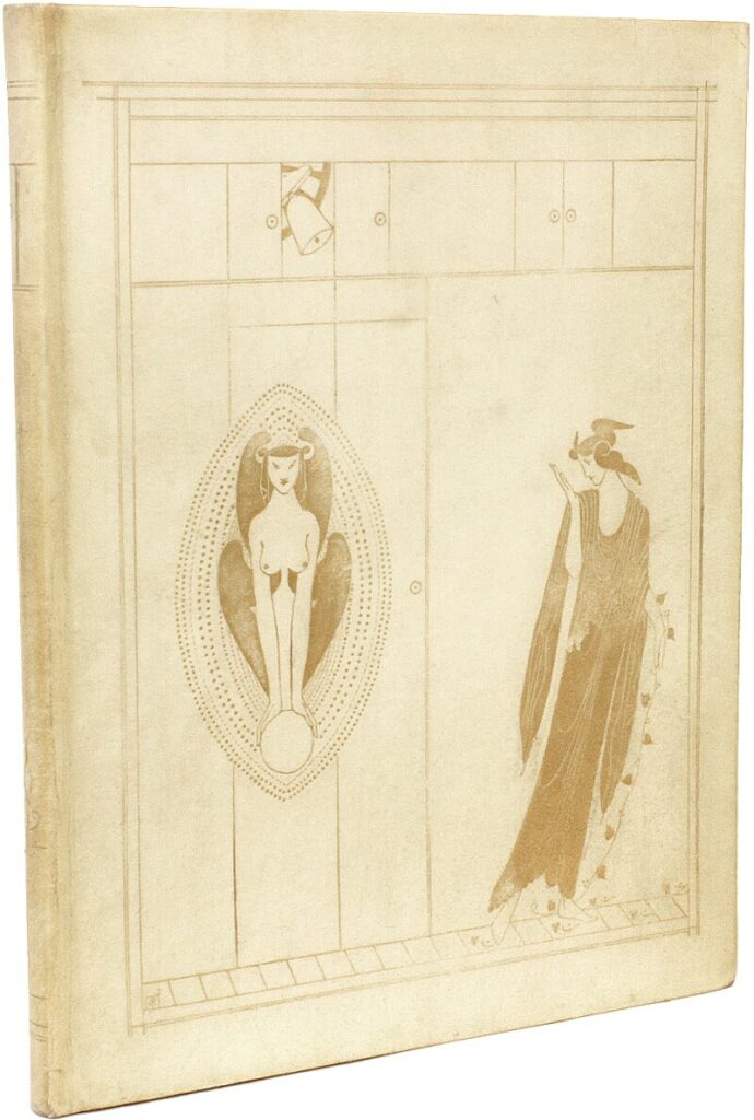
    The Sphinx: “I mde an effort away from the Renaissance towards a book marked by surviving classical traits, printing it in Capitals. In the pictures I have striven to combine, consciously or unconsciously, those affinities in line work broadcast in all epochs.

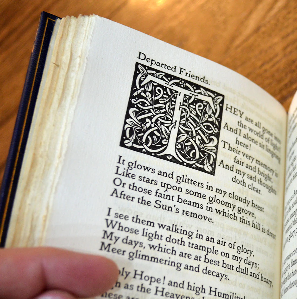
    Now the precedent for fine and rhythmic book decoration in printed books is so small that, besides the beautiful borders of Ratdolt, we shall find little or nothing for purses of study and stimulus. …These unclassed borders and initials appear in Venice in books publish3ed about 1493…1500 or thereabout. (30)

    One purely Renaissance border, engraved for “The World at Auction,” is an attempt on my part to express admiration for this forgotten designer. (31)

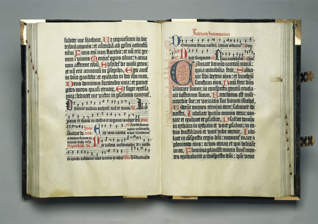
    Mainz Psalter, 1457, Fust & Schoeffer

    Günther Zainer

    The Mentelin Bible, Johann Mentelin, 1466

    Nicolas Jenson

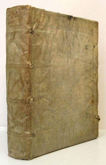
    Historiae Florentini Populi, Rubeus, 1476

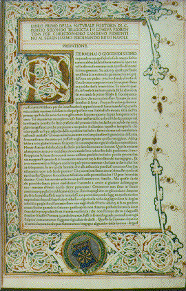
    Historia Naturalis, 1476, Jenson

    Anthony Koberger

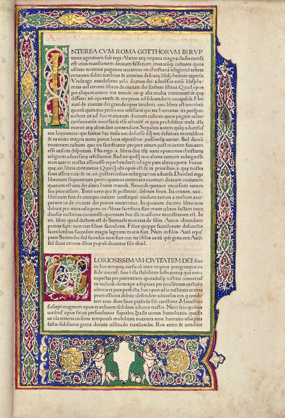
    De Civitate Dei, Sweynheym and Pannartz, 1470

    Recyell of the Histories of Troy, Caxton, 1473-4

    The Gutenberg Bible, 1454

    Albrecht Durer

    Aldine Virgil, 1501

    Hypnerotomachia Poliphili 1499

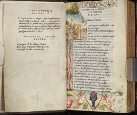
    Hero and Leander Aldus Manutius, 1449

    Erhard Ratdolt (1442–1528), Venice

    Herodotus, Venice, 1494

    Historiae Florentini populi, 1476

    Commentaria in Bibliam, 1498

    Vera historia, 1494

    Natural History, Pliny, Jenson, 1476

    Italian Manuscript Letters

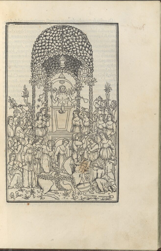
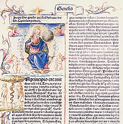
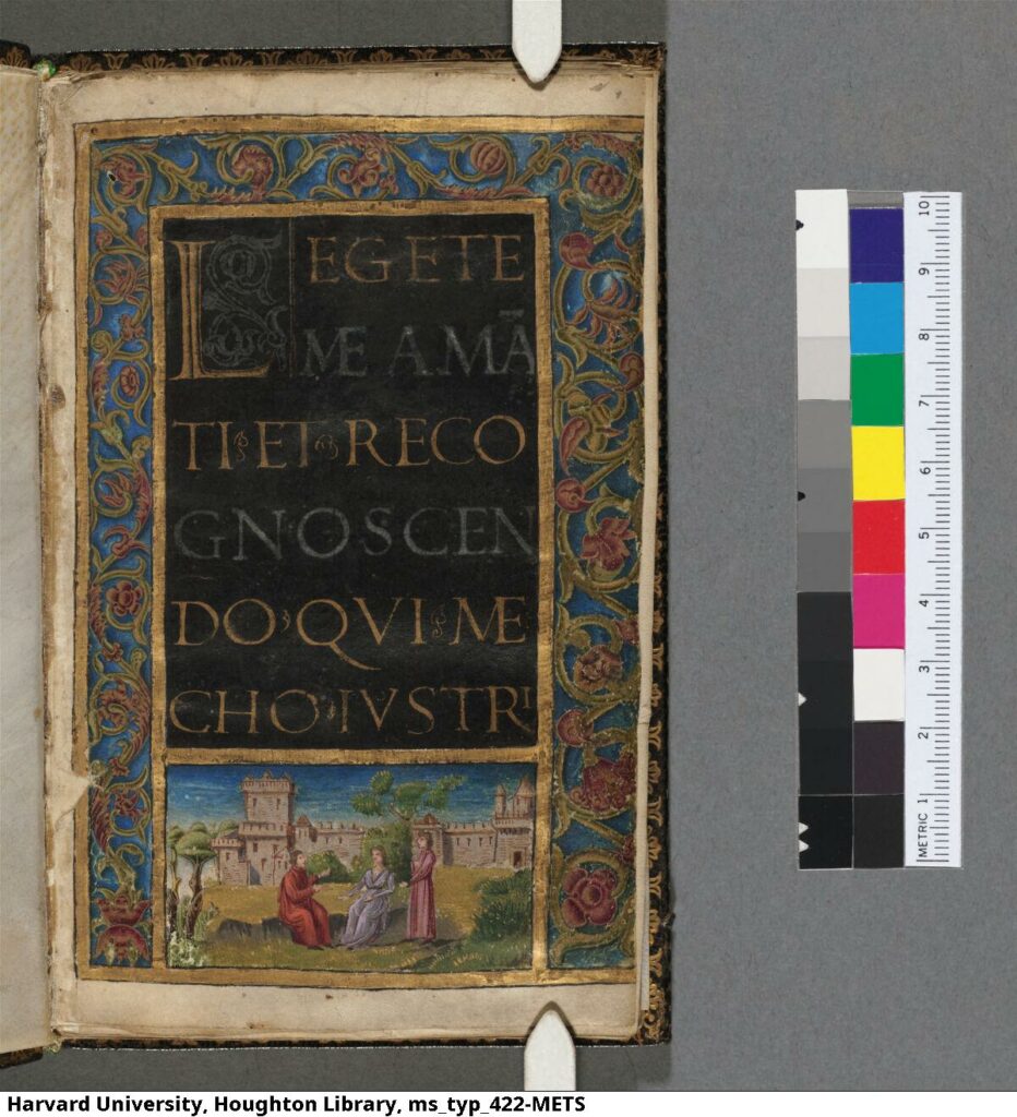
    15c Italian Illuminated Manuscript

    Herodotus. Venice, 1494

    Livius, Historiae Romanae Decades, 1493

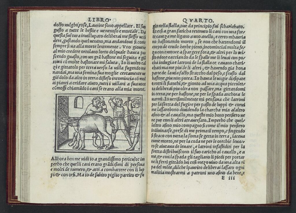
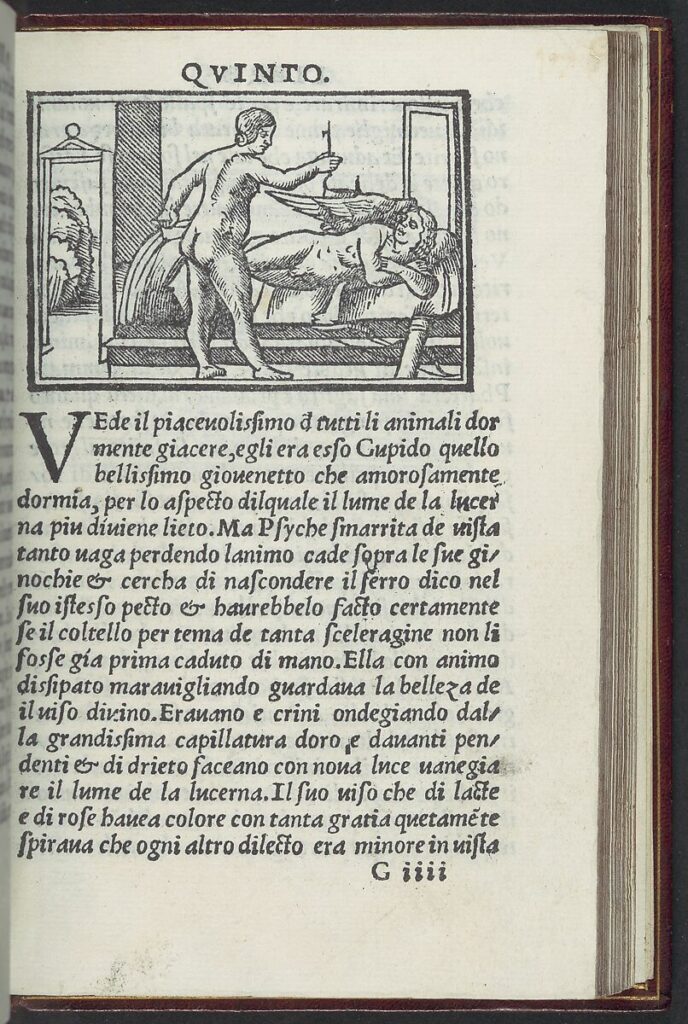
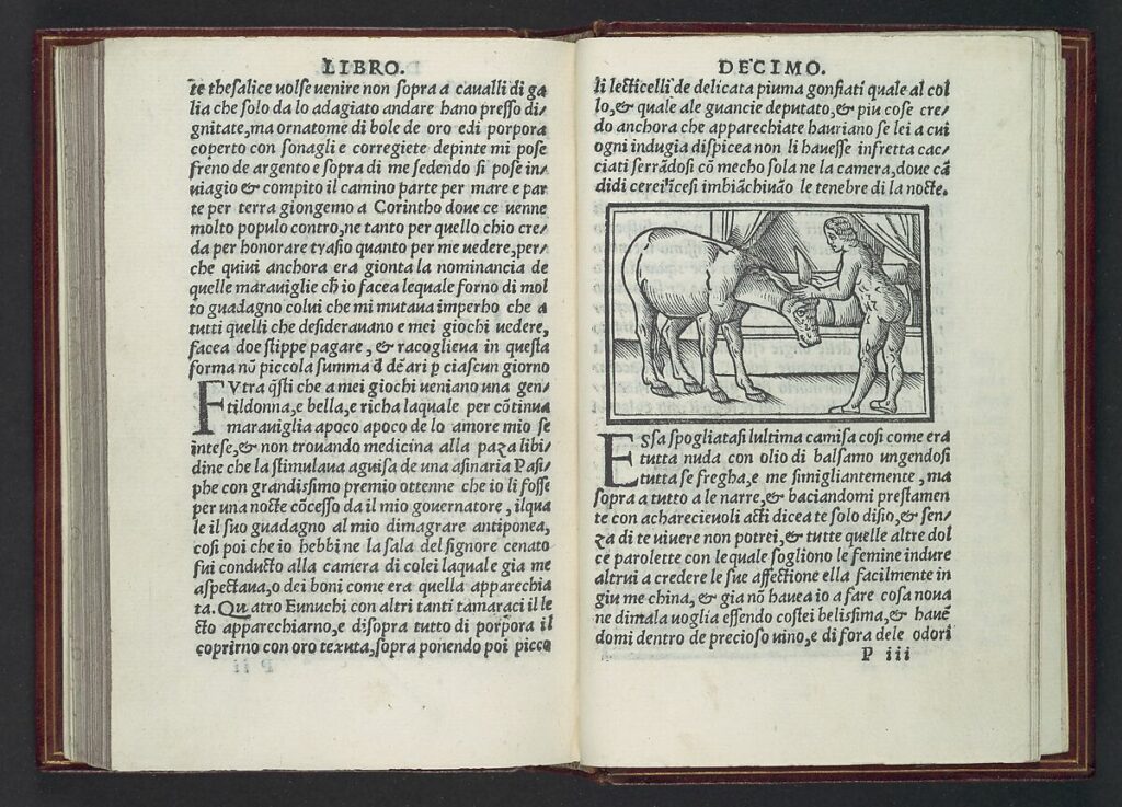
    Apuleius Metamorphoses, 1519
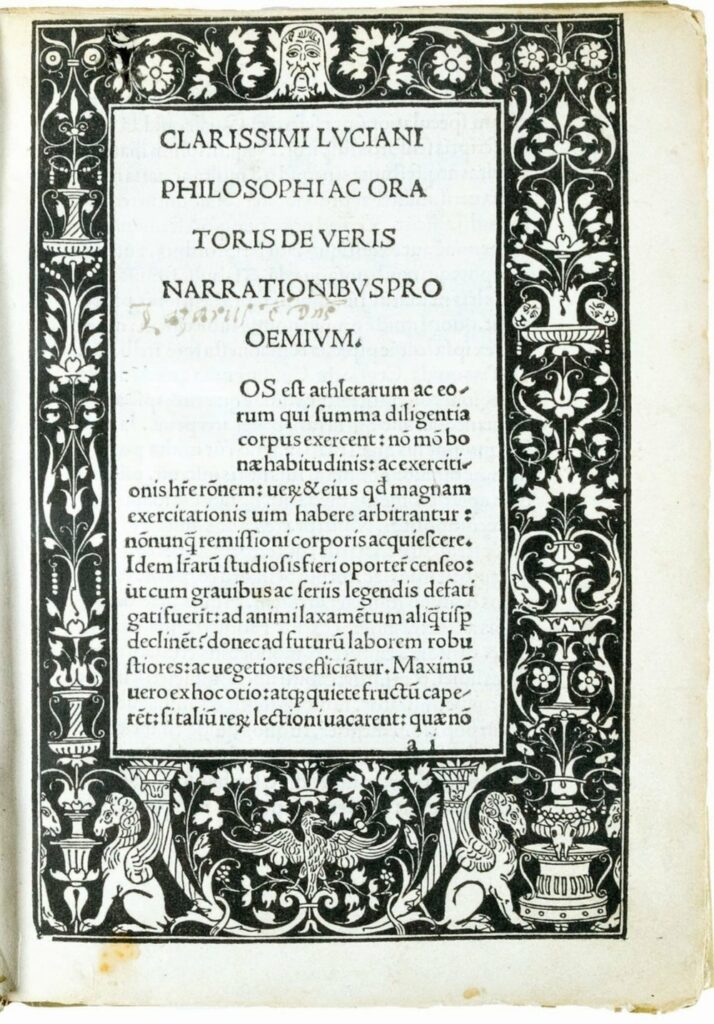
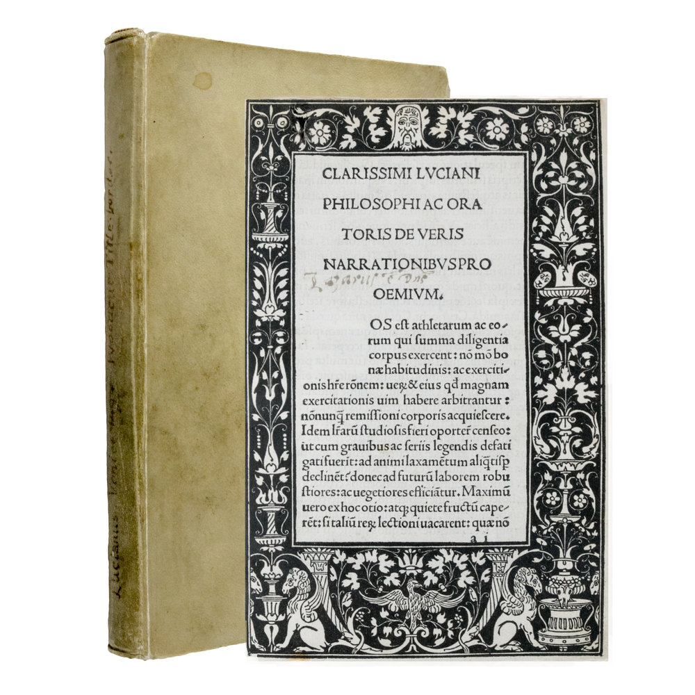
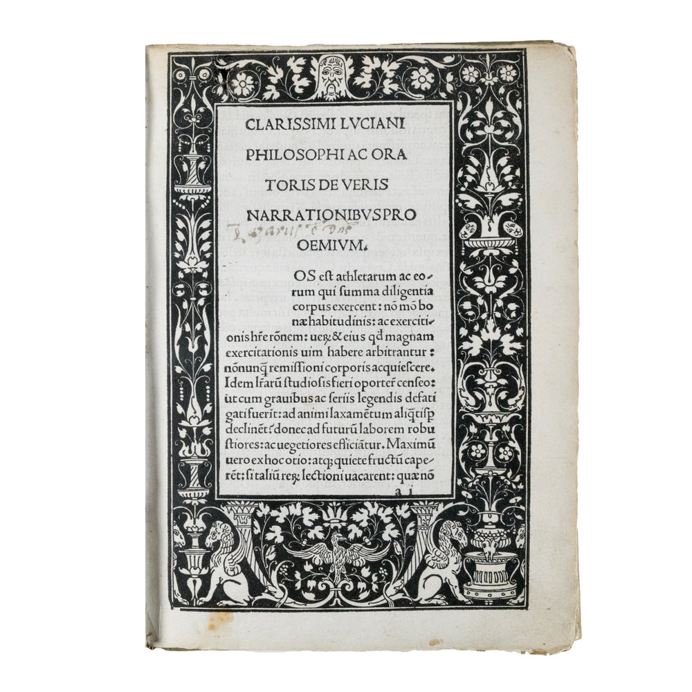
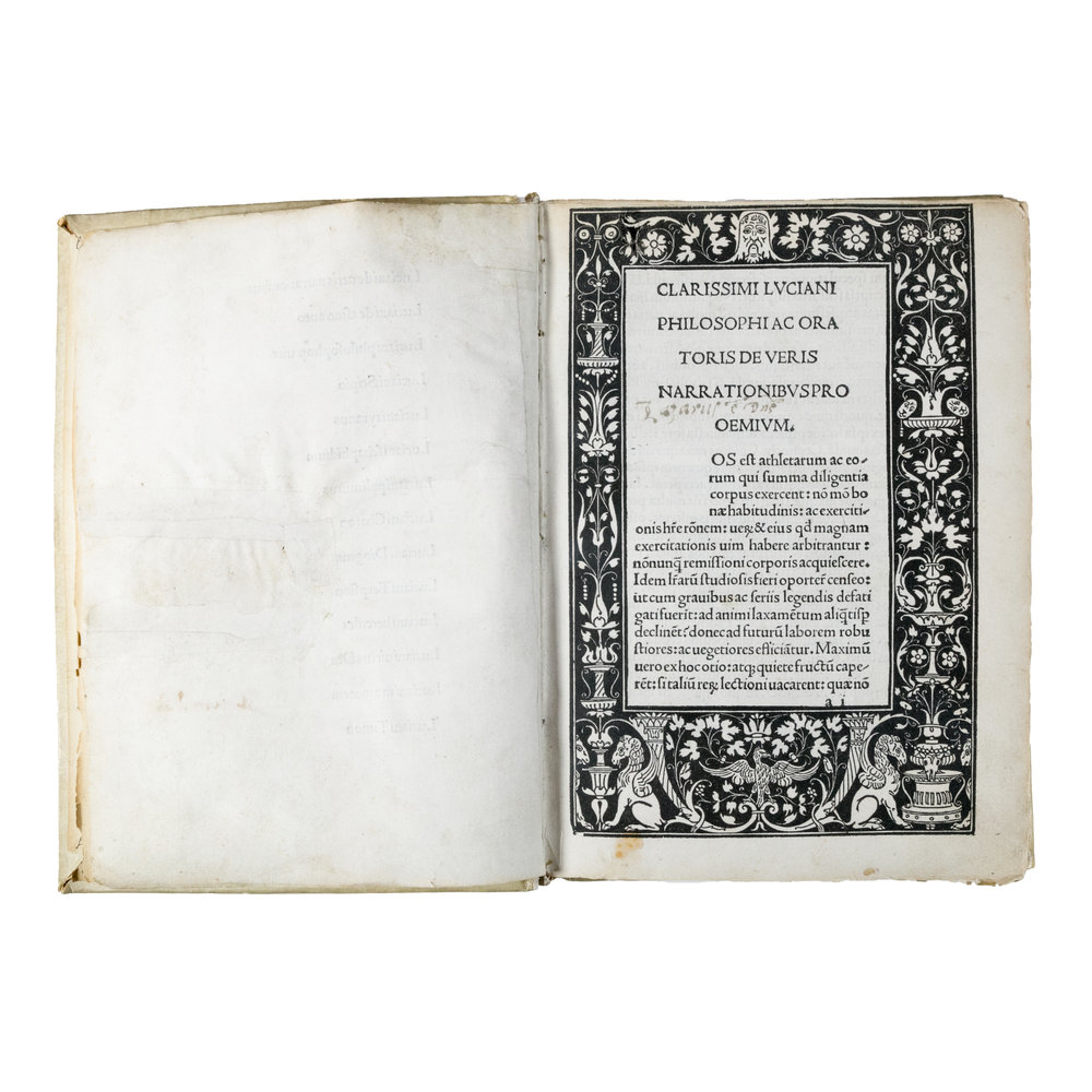
    Vera Historia, 1494

    Hieronymus, 1498

    Historia Naturalis, 1469

    De Civitate Dei, Spira

    Hypnerotomachia Poliphili 1499, Aldus Manutius

    Francesco Colonna (Italian, ca. 1453–1517) Hypnerotomachia Poliphili, December 1499 Italian, Woodcut; The Metropolitan Museum of Art, New York, Gift of J. Pierpont Morgan, 1923 (23.73.1-) http://www.metmuseum.org/Collections/search-the-collections/365313
    Untitled, 11/1/07, 9:50 AM, 16C, 7031×6461 (968+2279), 100%, HMI_Curve, 1/12 s, R67.6, G33.9, B35.3
    Untitled, 11/13/07, 11:41 AM, 16C, 6512×5492 (1241+1822), 100%, Default Settin, 1/15 s, R82.4, G48.5, B49.0

    Hero and Leander, Aldus Manutius, 1449

    Mainz Psalter 1457, Johann Fust and Peter Schoeffer

    Zanier

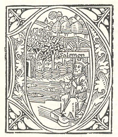
    Initial from the German Bible, printed by Zainer in Augsburg in 1477

    Printed list of works printed by Zainer, ca. 1480

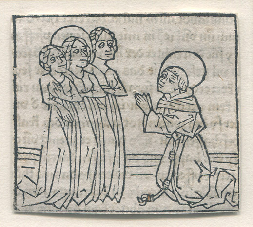
    Early woodcut print of a saint kneeling before three women by Zainer, circa 1473.

    The Mentelin Bible, 1466, Johann Mentelin

    Nicolas Jenson

    Roman type of Nicholas Jenson, 1472.

    A specimen of Nicolas Jenson’s archetypal roman typeface, from the “Laertis”, published in Venice c. 1475.

    Capitals of Nicolas Jenson’s roman typeface, from a translation ‘in Fiorentina’ (in Italian) of Pliny the Elder, published in Venice in 1476.

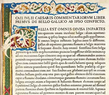
    Julius Caesar’s Works, printer Nicolas Jenson, 1471

    VK 405, Bible in Latin, Nicolas Jenson, Venice, 1479

    Pliny the Elder’s Natural History, printer Nicolas Jenson, 1476

    Historiae Florentini populi Jacobus Rubeus, 1476

    Historia naturalis, 1476, Jenson

    Anton Koberger

    Folio Page from “The Golden Legend” printed by Anton Koberger, 1488. The image depicts a saintly woman being anointed, possibly St. Mary or any number of other female saints.

    A page from the Nuremberg Chronicle, leaf 25 (page 49) printed by Anton Koberger circa 1492.

    De civitate dei. Sweynheym and Arnoldus Pannartz, 1470

    Recyell of the Histories of Troy, Caxton, 1473-4

    The Gutenberg Bible, 1454

    Albrecht Durer

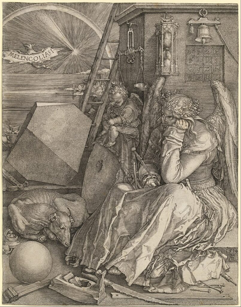
    Albrecht Durer Melencolia, copper engraving, 1514

    Albrecht Durer The Expulsion from Paradise, from The Small Passion, woodcut print, 1510

    Aldine Virgil, 1501

    Erhard Ratdolt (1442–1528), Venice

    M25160-136 001

    APPIANUS. Historia Romana. Latin translation by Petrus Candidus Decembrius Venice: Bernhard Maler, Erhard Ratdolt and Peter Löslein, 1477

    APPIANUS. Historia Romana. Latin translation by Petrus Candidus Decembrius. Part 2 (of 2) (Venice: Bernhard Maler, Erhard Ratdolt and Peter Löslein, 1477)

    Appian’s Historia Romana
    Erhard Ratdolt, 1477

    Venice, Bernhard Maler (Pictor), Erhard Ratdolt and Peter Loslein, 1477

    Herodotus, Venice, 1494

    Jacobus Rubeus

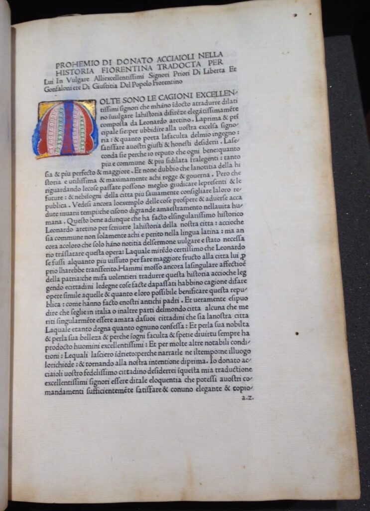
    Bruni, Leonardo [Leonardus Brunus Aretinus]. Historiae Florentini populi. Trans. Donato Acciaiuoli [Donatus Acciaiolus]. Venice: Jacobus Rubeus, 12 February 1476.

    Hieronymus, Johannes and Gregorius de Gregoriis, 1498

    Hieronymus, Sophronius Eusebius (347-420). Commentaria in Bibliam. Ed: Bernardinus Gadolus. Venice, Johannes and Gregorius de Gregoriis, de Forlivio, 1497 – 25 August 1498.

    Vera historia, 1494

    Natural History, Pliny, Jenson, 1476

    Italian Manuscript Letters

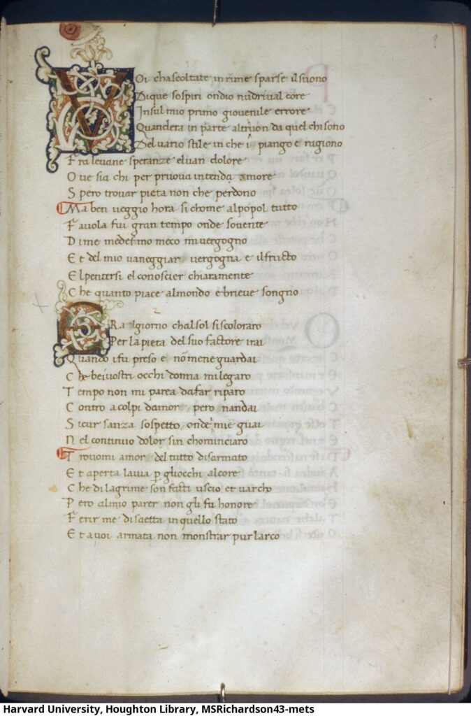
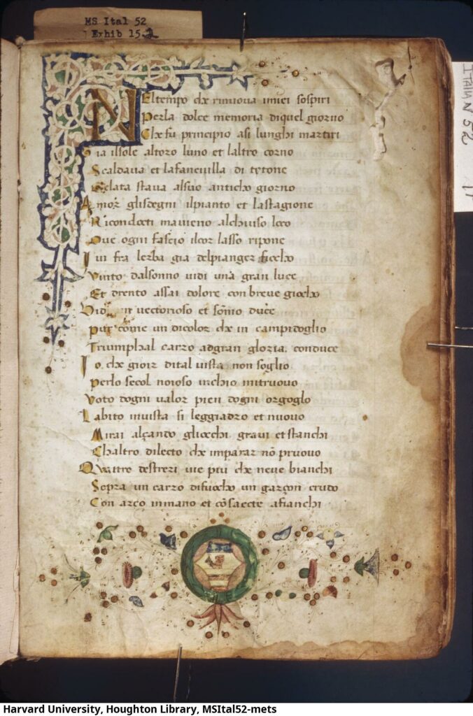
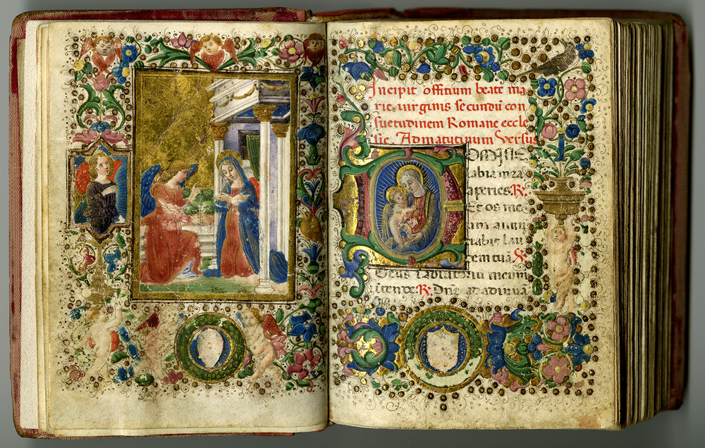
    Italian Illuminated Manuscript 1480
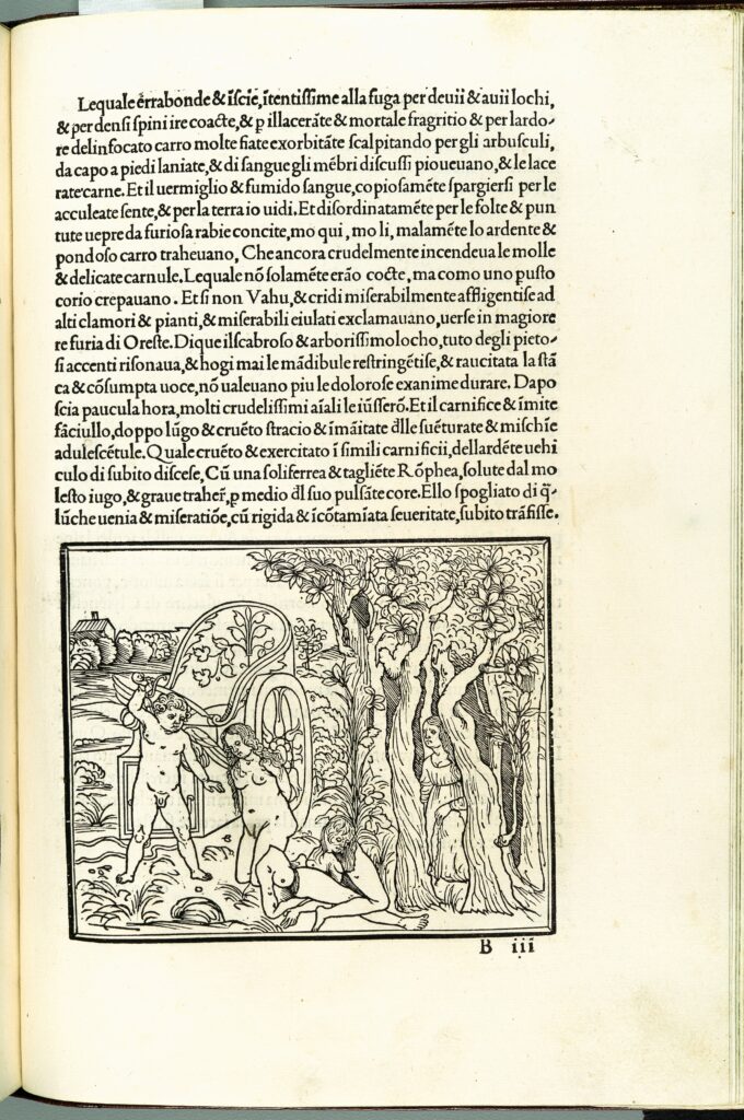
    Italian Woodcuts

    Livius, Historiae Romanae decades, 1493

    Apuleius’ Metamorphoses, 1519

    56.608.1(E2v&E3)
    56.608.1(g4)
    56.608.1(p2v&p3)

    Vera Historia, 1494

    Historia naturalis, 1469

    De civitate Dei, 1470, Spira

  • Ricketts Vale Gallery

    Ricketts Vale Gallery

    A House of Pomegranates, 1891

  • The Dial No. 5

    The Dial No. 5

    The Dial No. 5

    The Dial, vol. 5, 1897. Dial Digital Edition, edited by Lorraine Janzen Kooistra, 2018-2020. Yellow Nineties 2.0, Ryerson University Centre for Digital Humanities, 2020. https://1890s.ca/dialv5-all/

    THE DIAL FOR MDCCCXCVII

    Full-page Illustrations “THE INFANCY OF BACCHUS” AN ORI-
                GINAL LITHOGRAPH DRAWN ON THE STONE BY
    C. H. SHANNON

                “DECEMBER” AN ORIGINAL WOODCUT DESIGNED
                AND CUT UPON THE WOOD BY
    C. H. SHANNON

                “THE DRESSING ROOM” FROM THE “STONE BATH
                SERIES” A PAPER LITHOGRAPH BY
    C. H. SHANNON

                “PAN ISLAND” AN ORIGINAL WOODCUT DESIGNED
                AND CUT UPON THE WOOD BY
    T. STURGE MOORE

                “CENTAUR WITH A BOUGH” AND “THE HARE MAKING
                CIRCLES IN HER MIRTH” BEING TWO ORIGINAL
                WOODCUTS DRAWN AND CUT UPON THE WOOD BY
    T. STURGE MOORE

                “THE VISION OF KING JAMES THE FIRST OF SCOT-
                LAND” ❧ AFTER A PEN DESIGN BY
    C. RICKETTS

                “PAN HAILING PSYCHE ACROSS THE RIVER” ❧
                AFTER A PEN DESIGN BY
    C. RICKETTS

                “RUTH, ORPAH, AND NAOMI” AND “RUTH THE
                GLEANER” BEING TWO ORIGINAL WOODCUTS DRAWN
                AND CUT UPON THE WOOD BY
    LUCIAN PIZZARRO.

    CONTENTS

                “LA VIE ELARGIE” BY
    EMILE VERHAEREN

                “OPEN THE DOOR, POSY” BY
    LAURENCE HOUSMAN

                “THE PHANTOM SEA-BIRD” BY
    T. STURGE MOORE

                “THE FATE OF THE CROSS-WAYS” BY
    MICHAEL FIELD

                “ST. IVES, CORNWALL” BY
    JOHN GRAY

                “THE CENTAUR” BY MAURICE DE GUERIN, TRANS-
                LATED BY
    T. STURGE MOORE

                “LEDA” BY
    JOHN GRAY

                “THE ART OF OUTAMARO” BY
    CHARLES STURT

    THE WRAPPER AND INITIAL LETTERPIECES IN THE TEXT
    HAVE BEEN DESIGNED AND ENGRAVED ON THE WOOD BY
    CHARLES RICKETTS. THE TWO FULL PAGE PEN DESIGNS
    MARKED ABOVE WITH A DEVICE HAVE BEEN REPRODUCED
    BY MESSRS. HENTSCHEL AND BY THE SWAN ELECTRIC
    ENGRAVING COMPANY. THE LITHOGRAPHS HAVE BEEN
    PRINTED BY MR. THOMAS WAY.

  • The Dial No. 4 1896

    The Dial No. 4 1896

    The Dial No 4 1896

    The Dial, vol. 4, 1896. Dial Digital Edition, edited by Lorraine Janzen Kooistra, 2018-2020. Yellow Nineties 2.0, Ryerson University Centre for Digital Humanities, 2020. https://1890s.ca/dialv4-all/

    THE DIAL NO IV MDCCCXCVI
    ART CONTENTS

                “DELIA” AN ORIGINAL LITHOGRAPH DRAWN UPON THE
                             STONE BY                        CHARLES H. SHANNON

                “A STUDY OF MICE” ❧AFTER A SILVERPOINT DRAWING BY
                                                                            CHARLES H. SHANNON

                “ATALANTA” AN ORIGINAL LITHOGRAPH DRAWN UPON THE
                            STONE BY            CHARLES H. SHANNON

                “LE PETIT CHAPERON ROUGE” AN ORIGINAL WOODCUT
                            DESIGNED AND CUT ON THE WOOD BY
                                                                            LUCIEN PISSARRO

                “DEATH OF THE DRAGON”AN ORIGINAL WOODCUT
                            DESIGNED AND CUT ON THE WOOD BY
                                                                            T. STURGE MOORE

                “BABY GIANTS” AN ORIGINAL WOODCUT DESIGNED AND
                            CUT ON THE WOOD             BY T. STURGE MOORE

                “AN ILLUSTRATION TO THE KING’S QUAIR”❧AFTER A
                            DESIGN BY                        CHARLES RICKETTS

                TWO PAGES OF THE VALE TYPE (WITH INITIAL) DESIGNED
                            BY                                    CHARLES RICKETTS

                “WOTAN AND LOGI DEPART IN SEARCH OF THE REINGOLD”
                            ❧AFTER A PEN DRAWING BY        REGINALD SAVAGE

    CONTENTS

                ‘THE FLYING FISH” A POEM BY JOHN GRAY
                “EN ROUTE” AN ARTICLE  BY JOHN GRAY
                “A PRAYER TO VENUS” A POEM  BY T. STURGE MOORE
                “THE BEAUTIES OF NATURE” BY  JOHN GRAY
                “A SONNET” BY  MICHAEL FIELD
                “THE WRITING ON THE WALL” BY W. DELAPLAINE SCULL
                “BATTLEDORE” TWO POEMS BY JOHN GRAY

                THE WRAPPER AND INITIAL LETTERPIECES IN THE TEXT
                HAVE BEEN DESIGNED AND ENGRAVED ON THE WOOD BY
                CHARLES RICKETTS. THE THREE FULL PAGE ILLUSTRATIONS
                MARKED ABOVE WITH A DEVICE HAVE BEEN REPRODUCED,
                THE FIRST BY THE SWAN ELECTRIC ENGRAVING COMPANY
                THE SECOND AND THIRD BY MESSRS. WALKER AND BOU-
                TALL. THE LITHOGRAPHS HAVE BEEN PRINTED BY MR.
                THOMAS WAY.

  • The Dial No. 3, 1893

    The Dial No. 3, 1893

    The Dial No. 3, 1893

    The Dial, vol. 3, 1893. Dial Digital Edition, edited by Lorraine Janzen Kooistra, 2018-2020. Yellow Nineties 2.0, Ryerson University Centre for Digital Humanities, 2020. https://1890s.ca/dialv3-all/

    THE DIAL NO III MDCCCXCIII

    Full-page Illustrations “CENTAURS” AN EXPERIMENT IN LINE
                DESIGNED BY
    REGINALD SAVAGE
                DRAWN AND ENGRAVED ON THE WOOD BY
    CHARLES S. RICKETTS

                “A ROMANTIC LANDSCAPE” AN ORIGINAL LITHO-
                GRAPH DRAWN UPON THE STONE BY
    CHARLES HAZELWOOD SHANNON

                “PHÆDRA AND ARIADNE”,—“AND YOU WILL SEE
                ARIADNE GAZING AT HER SISTER PHÆDRA WHO
                HANGS BY A ROPE” PAUSANIAS ❧ A REPRO-
                DUCTION OF A PEN DRAWING BY
    CHARLES RICKETTS

                “WHITE NIGHTS” AN ORIGINAL LITHOGRAPH BY
    CHARLES SHANNON

                “PAN MOUNTAIN” AN ORIGINAL WOODCUT DE-
                SIGNED AND ENGRAVED ON THE WOOD BY
    T. STURGE MOORE

                “IN THE THEBAID” AN ILLUSTRATION TO A POEM
                “THE SPHINX” BY OSCAR WILDE TO BE PUBLISHED
                AT THE SIGN OF THE BODLEY HEAD ❧ A REPRO-
                DUCTION OF A PEN DRAWING BY
    CHARLES RICKETTS

                AN INTRUDER” AN ORIGINAL LITHOGRAPH DRAWN
                UPON THE STONE BY
    CHARLES SHANNON

                “SOLITUDE” AN ORIGINAL WOODCUT DRAWN AND
                ENGRAVED ON THE WOOD BY
    LUCIEN PISSARRO

                “THE TOPMOST APPLE” AN ORIGINAL WOODCUT
                FROM THE VALE EDITION OF DAPHNIS AND CHLOE
                DESIGNED AND ENGRAVED ON THE WOOD BY
    CHARLES SHANNON

                “THE LOTOS-EATERS” ❧ A REPRODUCTION OF A
                PEN DRAWING BY
    REGINALD SAVAGE

    CONTENTS

                “DANAE” BY
    T. STURGE MOORE

                “A NOTE ON GUSTAVE MOREAU” BY
    CHARLES R. STURT

                “SOME SHADOWS OF A THOUGHT” “SONNET AFTER
                RONSARD” “THE PIMPERNEL”  “ENFANCE” AND
                “THROUGH A CHILDS EYES” AFTER RIMBAUD
                “CHORUS OF GREEK GIRLS” BY
    T. STURGE MOORE

                “GARTH WILKINSON” BY
    JOHN GRAY

                “OLD KITTY” BY
    T. STURGE MOORE

                “A HYMN TRANSLATED FROM THE ITALIAN OF
                ST FRANCIS OF ASSISI” BY
    JOHN GRAY

                THE WRAPPER AND INITIAL LETTERPIECES IN THE
                TEXT HAVE BEEN DESIGNED AND ENGRAVED ON
                THE WOOD BY CHARLES RICKETTSTHE SMALL
                WOODCUT ON PAGE 20 IS BY T. STURGE MOORE.
                THREE FULL PAGE ILLUSTRATIONS MARKED ABOVE
                WITH A DEVICE HAVE BEEN REPRODUCED BY
                MESSRS. WALKER AND BOUTALL

    PERSONAL NOTE
                “POEMS DRAMATIC AND LYRICAL” THE PLATE
                FACING PAGE 200 AND APPEARING TO ILLUSTRATE
                THE POEM “THE PRODIGAL (AFTER ALBERT
                DURER)” WAS DONE AS AN ILLUSTRATION TO A
                DIFFERENT POEM BY LORD DE TABLEY ON THE
                SAME SUBJECT “THE PRODIGAL” PAGE 189 “RE-
                HEARSALS.” THROUGH INADVERTENCE NO MEN-
                TION WAS MADE OF THIS MISTAKE IN THE SECOND
                EDITION OF “POEMS DRAMATIC AND LYRICAL”

  • The Dial No. 2 1892

    The Dial No. 2 1892

    The Dial No. 2

    The Dial, vol. 2, 1892. Dial Digital Edition, edited by Lorraine Janzen Kooistra, 2018-2020. Yellow Nineties 2.0, Ryerson University Centre for Digital Humanities, 2019. https://1890s.ca/dialv2-all/

    Image from the Dial, No. 2, 1892

    ❧ ❧ CONTENTS. ❧ ❧

                            “THE MARRED FACE”. . . . by
    CHARLES RICKETTS.

                            “PARSIFAL” IMITATED FROM
                            THE FRENCH OF PAUL VERLAINE
    JOHN GRAY.

                            “TO THE FLOWERS, TO WEEP” by
    HERBERT P. HORNE.

                            “TO THE MEMORY OF ARTHUR
                            RIMBAUD”. . . . . . . by
    T. STURGE MOORE.

    Unsigned         “MAURICE DE GUERIN”

                            “ON A PICTURE BY PUVIS DE CHA-
                            VANNES”
                            “BITTEN APPLES”
                            “LOVE LIES BLEEDING”
                            “THE LITTLE BROWN WOOD-MOUSE”
                            “GUST-DISGUSTED GEESE”
                            “LES CHERCHEUSES DE POUX” FROM
                            THE FRENCH OF ARTHUR RIMBAUD
                            “PYGMALION”
                            “ON A DRAWING BY C. H. S.” . by
    T. STURGE MOORE.

                            “KING COMFORT”. by
    T. STURGE MOORE.

                            “HEART’S DEMESNE”
                            “LES DEMOISELLES DE SAUVE” by
    JOHN GRAY.

    Unsigned         “THE UNWRITTEN BOOK”

                            “THE BRIDAL”
                            “ELLA THE SHE-BEAR”
                            “SNOW IN SPRING” by
    CHARLES RICKETTS.

                            The issue is strictly limited
                            to two hundred copies, numbered,
                            of which this is . .

                                        N°…

                                                                            THE VALE
                                                                            1892

    THE DIAL ❧ No 2 ❧

    OF THE SERIES.

    Full Page Illustrations“THE PALACE BURNS
            AND BEHEMOTH” DESIGNED AND
            ENGRAVED ON THE WOOD BY
    REGINALD SAVAGE.

            “SHEPHERD IN A MIST” DRAWN
            ON THE STONE AND BITTEN BY
    CHARLES HASLEWOOD SHANNON.

            “SISTER OF THE WOODS” DESIGNED
            AND ENGRAVED ON THE WOOD BY
    LUCIEN PISSARRO.

            “REPEATED BEND” AN ORIGINAL
            LITHOGRAPH BY
    CHARLES H. SHANNON.

            “WITH VIOL AND FLUTE” AN
            ORIGINAL LITHOGRAPH BY
    CHARLES H. SHANNON.

            “MY HAIR IS FILLED WITH THE DROPS
            OF THE NIGHT” DESIGNED AND EN-
            GRAVED ON THE WOOD BY
    CHARLES RICKETTS.

                            The cover and decorations in the
                            text, have been designed and engraved
                            on the wood by . . . CHARLES RICKETTS.

  • Dial No 1 1889

    Dial No 1 1889

    THE DIAL NO. 1

    The Dial, vol. 1, 1889. Dial Digital Edition, edited by Lorraine Janzen Kooistra, 2018-2020. Yellow Nineties 2.0, Ryerson University Centre for Digital Humanities, 2019. https://1890s.ca/dialv1-all/

    TABLE OF CONTENTS

    PUVIS DE CHAVANNES.. . . . . . . . C. Ricketts

    A SIMPLE STORY. . . . . . . . C. H. Shannon.

    LES GONCOURT. . . . . . . . John Gray.

    THE GREAT WORM. . . . . . . . John Gray.

    A GLIMPSE OF HEAVEN. . . . . . . . C. Ricketts.

    NOTES. . . . . . . . R. Savage.

    THE CUP OF HAPPINESS. . . . . . . . C. Ricketts.

    SENSATIONS

    APOLOGY

    LIST OF ILLUSTRATIONS

    AA. Illustration to THE GREAT WORM. Lithograph
        designed by C. Ricketts..Executed by M. and N. Hanhart.

    AB. RETURN OF THE PRODIGAL. . . . . . . . C. H. Shannon.

    AC. THE MIRACLE OF THE ROSES. . . . . . . . Reginald Savage.

    AD. THE QUEEN OF SHEBA (after a pastel). . . . C. H. Shannon.

    AE. Illustration to THE GREAT WORM. Etched
        by C. Ricketts.

    AF. Illustration to A GLIMPSE OF HEAVEN. . . . C. H. Shannon.

    AG. CIRCE THE ENCHANTRESS (after a watercolour). C. H. Shannon.

    The cover, initials, and tail pieces are designed by C. Ricketts.
    The cover is engraved by C. H. Shannon.

    This number is published by C. H. Shannon, The Vale, Kings
    Road, Chelsea, S.W., from whom copies can be obtained; price seven
    shillings and sixpence.

  • De civitate Dei, 1470

    De civitate Dei, 1470

    AUGUSTINUS, Aurelius (354-430). De civitate Dei. Venice: Johannes and Vindelinus de Spira, 1470.

    AUGUSTINUS, Aurelius (354-430). De civitate Dei. Venice: Johannes and Vindelinus de Spira, 1470.

    Royal 2° (399 x 280mm). Collation: [1-28 3-2610 278 2810] (1/1 blank, 1/2r rubrics table, 2/8 blank, 3/1r prologue and text, 28/9r colophon, 28/10 blank). 273 leaves (of 274, without blank 2/8). 50 lines, table in two columns. Type: 1:110R. ILLUMINATED BY A CONTEMPORARY MILANESE ARTIST: 14-line initial opening prologue and 21 book initials (space for book 12 initial left blank) in burnished gold with white-vine decoration on blue, green and mauve ground with white dots, first text page with floral multi-colour and gold border sprays, coat-of-arms flanked by initials ‘PA’ and ‘P’ in lower margin, 2-line initials in red, chapter incipits and guide-letters, and headlines giving book numbers in rose ink, a few guide-letters to major initials preserved at extreme fore-margin. (Small wormholes in table, a few small expertly repaired marginal tears, occasional insignificant stain.) Brown morocco tooled in blind, spine lettered in gilt, gilt turn-ins, by Rémy Petit (a few light scuffmarks, short split at upper hinge). Provenance: unidentified contemporary owner, probably from a Lombard or Milanese noble family (arms) — 17th-century collational notes on first and last blanks — [with John Howell, Catalogue 40/3 (1970)].

    FIRST VENETIAN EDITION, THE FOURTH BOOK PRINTED AT VENICE, and fourth or fifth edition of De civitate Dei. Johannes de Spira established the first press at Venice in 1469, printing an edition of Cicero’s Epistolae ad familiares in 100 copies. It was followed by a larger (300 copies) reprint of the Cicero, and Pliny’s Historia naturalis. As the colophon to the press’s next production, St. Augustine’s De civitate Dei, famously states, Johannes died suddenly and the edition was completed by his brother Vindelinus, named here for the first time. The colophon also gives valuable evidence for the earlier books, stating that the Pliny was printed in 100 copies within 3 months. Based on the number of other works subsequently printed by Vindelinus in 1470, Geldner argues that his Augustinus appeared early in 1470 and thus pre-dates Sweynheym and Pannartz’s edition printed at Rome the same year (Die deutschen Inkunabeldrucker, pp.62-4). H *2048; GW 2877; BMC V, 153 (IC. 19510); IGI 969; CIBN A-679; Goff A-1233.

  • Historia naturalis, 1469

    Historia naturalis, 1469

    Historia naturalis, 1469

    AUTHOR/ARTIST: 

    Pliny, the Elder.

    PUBLISHER: 

    [Venice : Johannes de Spira, before 18 Sept. 1469]

    DESCRIPTION: 

    [712] p. ; 42 cm. (fol.)