In Memoriam by Alfred Lord Tennyson, 1900
Back matter: “Seen through the press by C.J. Holmes and decorated with border designed by C.S. Ricketts and engraved by C.E. Keates printed at the Ballantyne Press London M.C.M. Hacon and Ricketts.”


In Memoriam by Alfred Lord Tennyson, 1900
Back matter: “Seen through the press by C.J. Holmes and decorated with border designed by C.S. Ricketts and engraved by C.E. Keates printed at the Ballantyne Press London M.C.M. Hacon and Ricketts.”


Empedocles on Etna, Matthew Arnold, 1896.
“The engraved decorations are by Charles Ricketts under whose supervision the book has been printed at the Ballantyne Press. Sold by Messrs. Hacon & Ricketts at the Sign of the Dial, LII Warwick Street, near Regent Street, W. LONDON MDCCCXCVI”
From Bibliography: “With border designed and cut on the wood by Charles Ricketts. Crown octavo. Two hundred and ten copies printed at ten shillings and sixpence. Border and colophon printed in red.” xxi


Vale Press. Empedocles on Etna, by Matthew Arnold, 1896
Vale Press. Empedocles on Etna, a Dramatic Poem, by Matthew Arnold, printed at the Ballentyne Press for Hacon & Ricketts, 1896, Scene I with decorative border by Charles Ricketts, printed in red, some spotting to untrimmed edges, free endpapers toned, original boards, printed paper labels to front cover and spine, spine somewhat toned and spotted, original glassine dust jacket, torn with losses, 8vo, (limited edition of 210 copies), together with De Cupidinis et Psyches Amoribus Fabula Anilis [by Lucius Apuleius], printed at the Ballantyne Press for Hacon & Ricketts, 1901, five woodcut illustrations by Charles Ricketts, first leaf of text with decorative initial and border, endpapers toned, untrimmed, original linen-backed boards with paper label to front cover, corners rubbed, spine lightly toned, slim folio, (limited edition of 310 copies), plus The Poems & Sonnets of Henry Constable, printed at the Ballentyne Press for Hacon & Ricketts, 1897, woodcut border and numerous decorative initials by Charles Ricketts, some spotting to untrimmed edges, endpapers toned, original boards, sides with red patterned paper designed by Ricketts, spine paper toned and spotted, printed paper spine label a trifle rubbed and chipped, with single folio publisher’s prospectus loosely inserted (partly toned), 8vo, (limited edition of 210 copies), with 3 other Vale Press titles: In Memoriam, by Alfred Lord Tennyson, 1900; The Kingis Quair, by King James I of Scotland, 1903; The Amber Witch, by Mary Schweidler, 1903, and a Ballentyne Press title: Unto This Last, by John Ruskin, published by George Allen, 1902, all limited editions
(Quantity: 7)
Vale Press: Tomkinson, pp.164-171. Empedocles: scarce with the dust jacket.


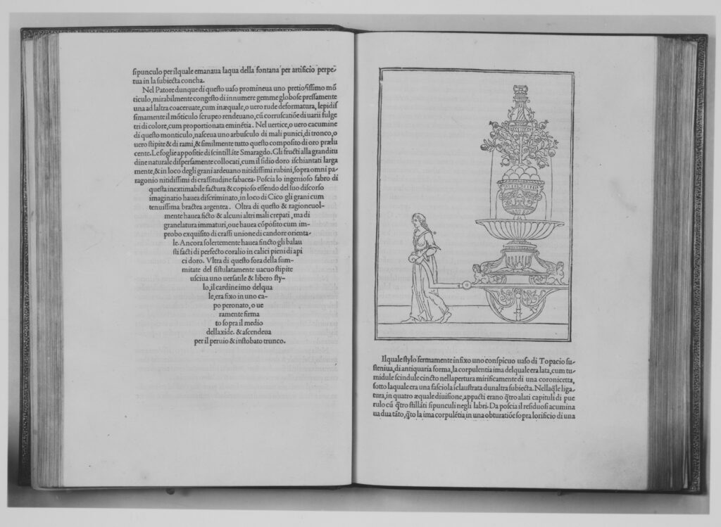
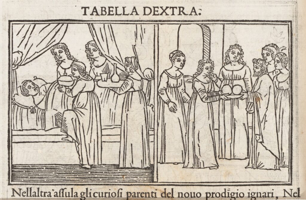
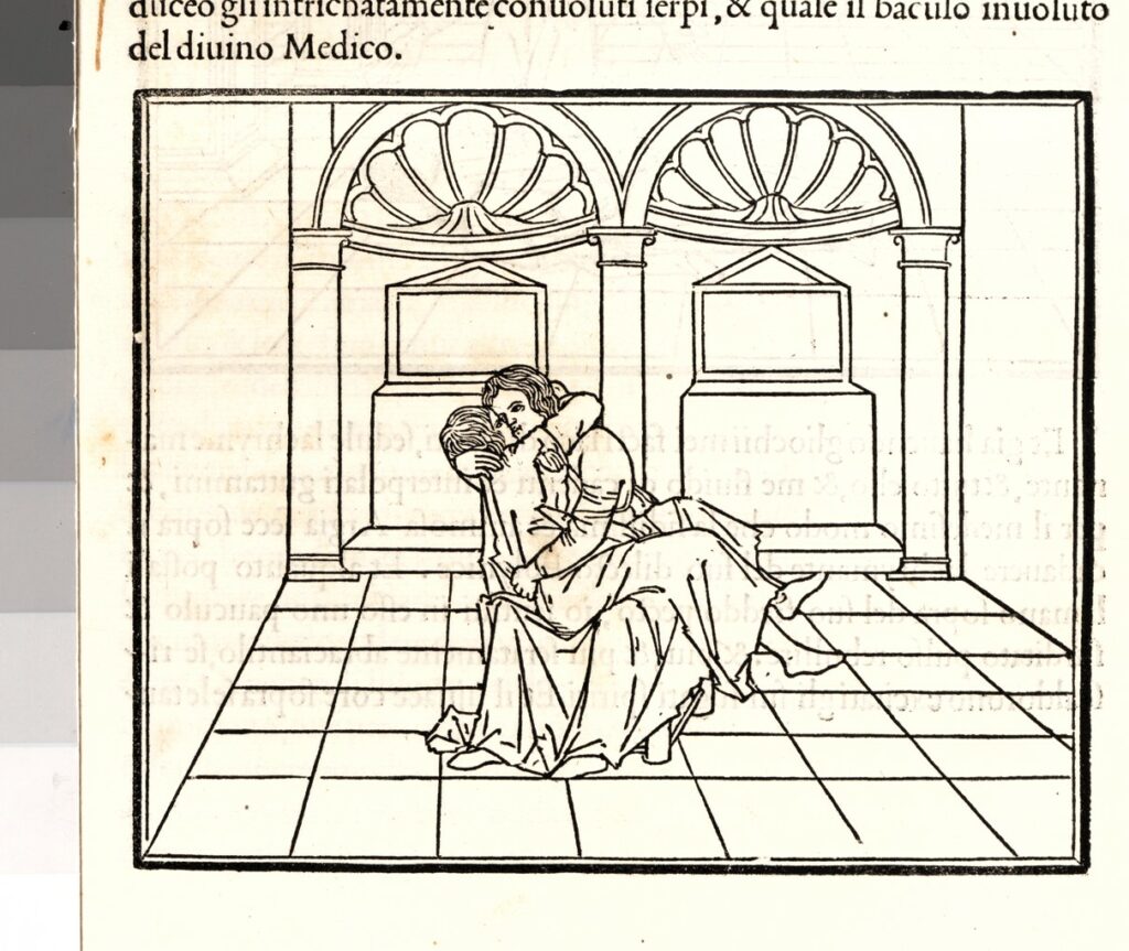
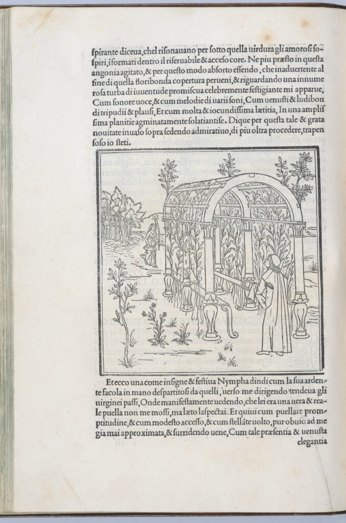
Hypnerotomachia Poliphili, December 1499
Title: Hypnerotomachia Poliphili
Author: Francesco Colonna (Italian, ca. 1453–1517)
Publisher: Aldo Manuzio (Italian, 1449/50–1515)
Designer: Design of woodcuts attributed to Benedetto Bordone (Italian, Padua ca. 1455/60–1530 Padua, active mainly Venice from 1488)
Binder: Copy of so-called Canevari binding
Published in: Venice
Date: December 1499
Medium: Printed book with woodcut illustrations
Dimensions: 11 5/8 × 8 11/16 × 1 9/16 in. (29.5 × 22 × 4 cm)
Represents: “tale of love and antiquarianism and a prime document of the Renaissance rediscovery of classical antiquity
produced by the important Venetian publisher Aldus Manutius (ca. 1450–1515). A specialist in the publication of Greek texts, Aldus was also famous for developing new formats, such as the small, handheld book, and new typefaces, such as the italic
The typeface used in the Hypnerotomachia Poliphili, based on ancient Roman inscriptions, was created by Aldus’ type designer Francesco Griffo of Bologna especially for this book, which has long been admired for its harmonious marriage of text and image. The spare and elegant illustrations reveal a careful study of ancient art as well as an interest in the new science of one-point linear perspective.”
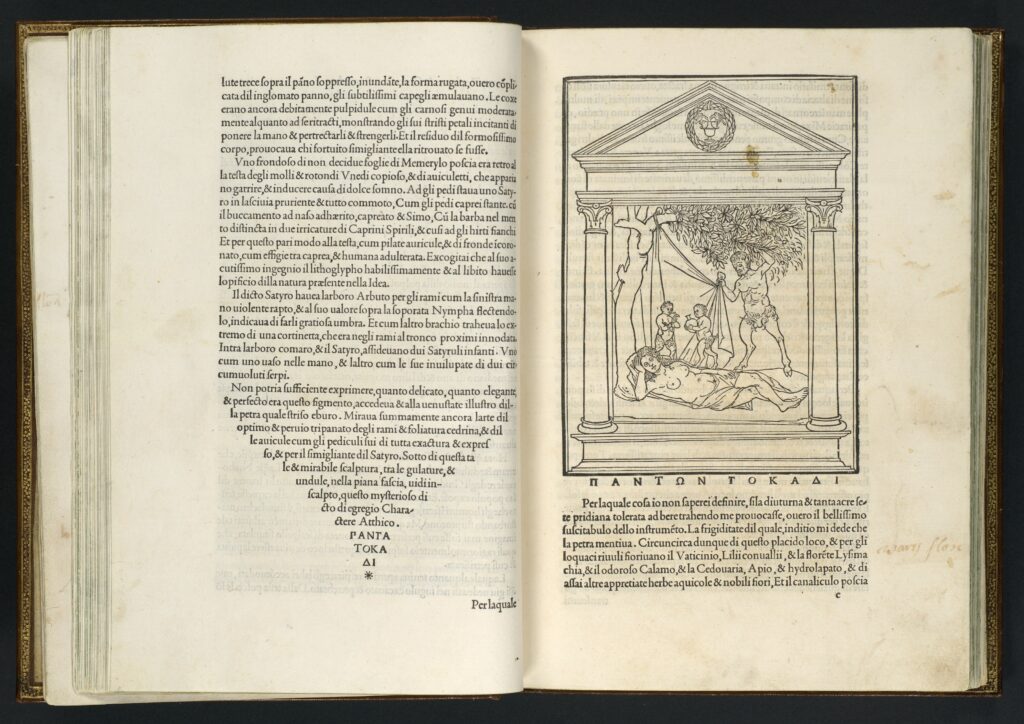
signature d8 verso and e1 recto (Text; Satyr with Sleeping Nymph)
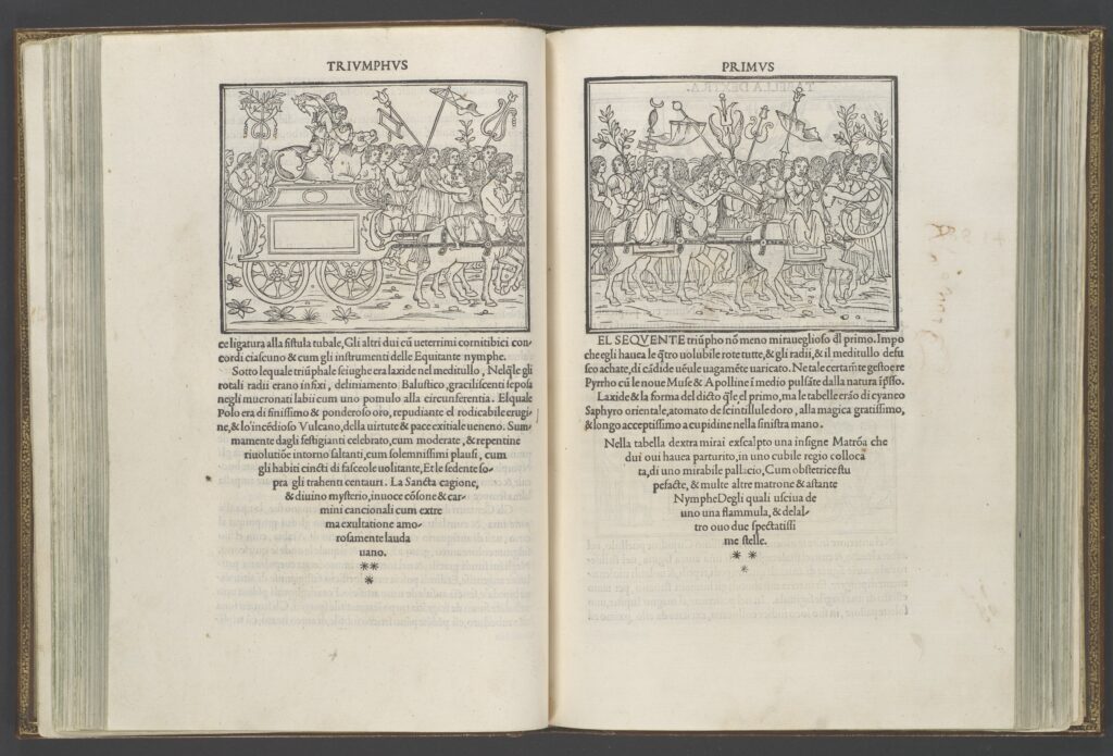
signature k5 verso and k6 recto (First Triumph, right and left sides)
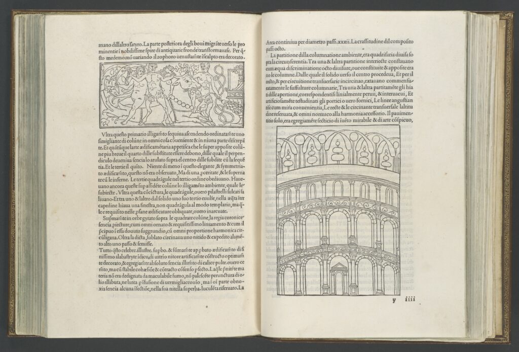
signature y3 verso and y4 recto (Nymphs and satyrs; amphitheater)
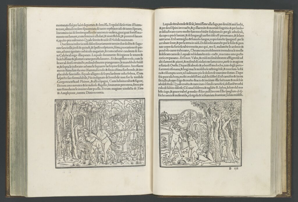
signature b2 verso and b3 recto (Polia’s dream: Cupid in chariot; Cupid with sword)
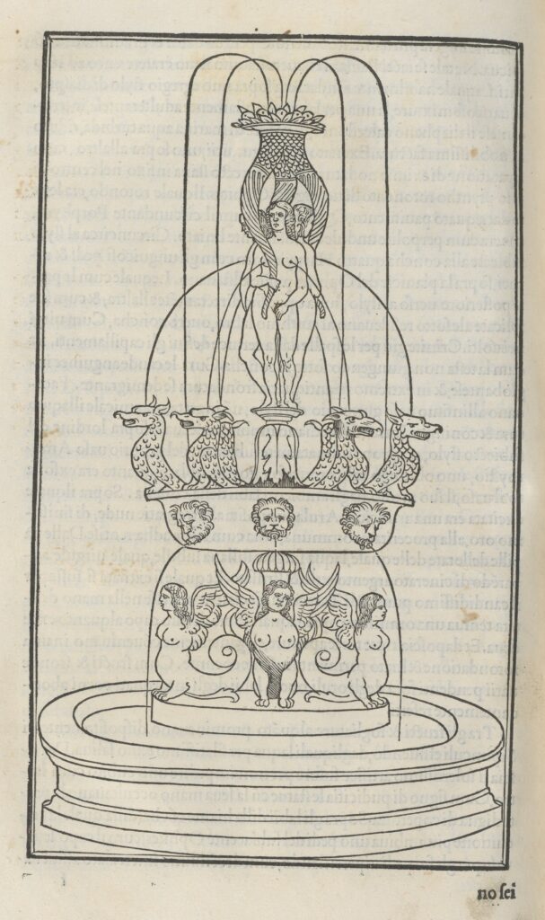
Verso of page “f”

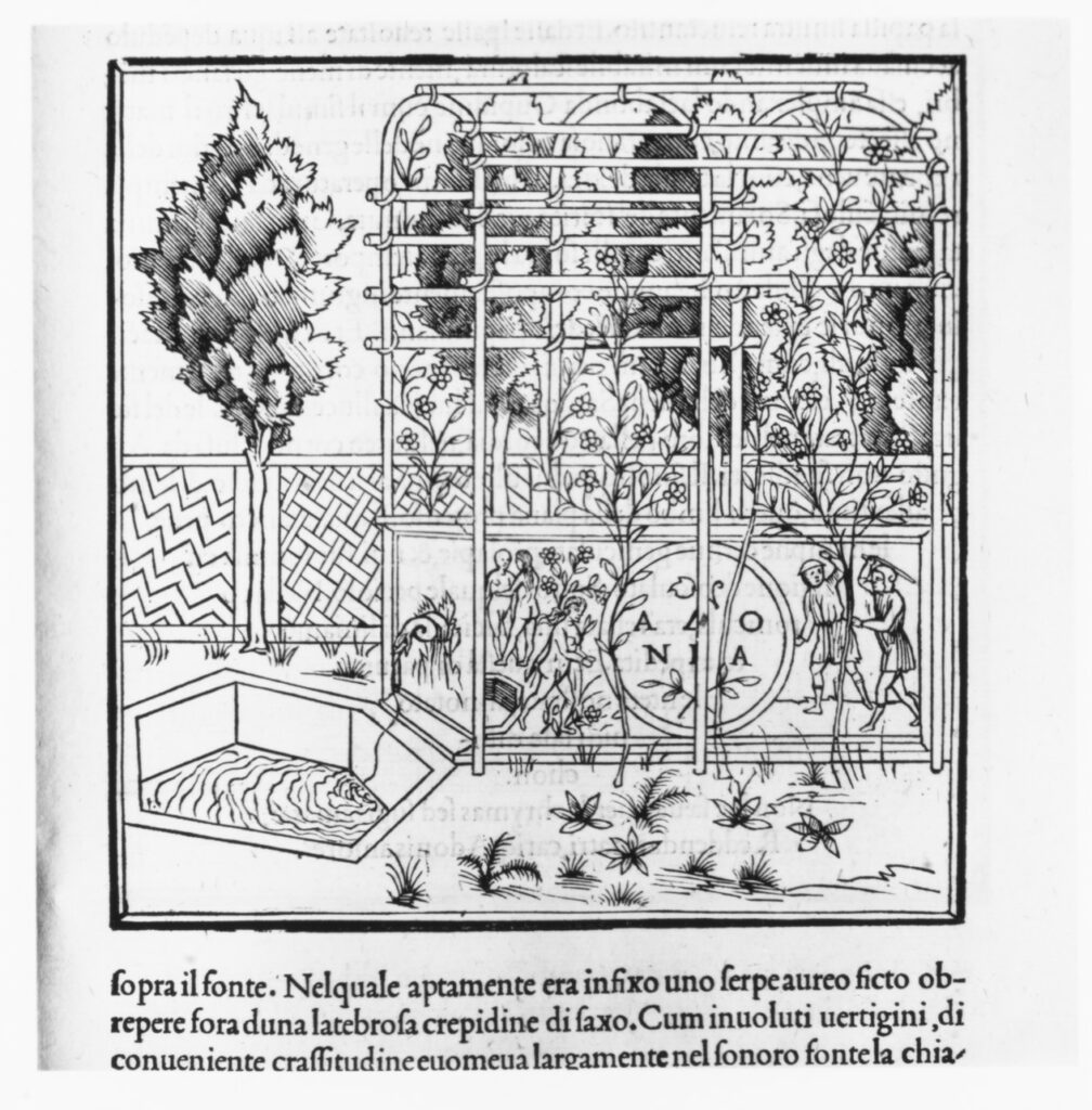
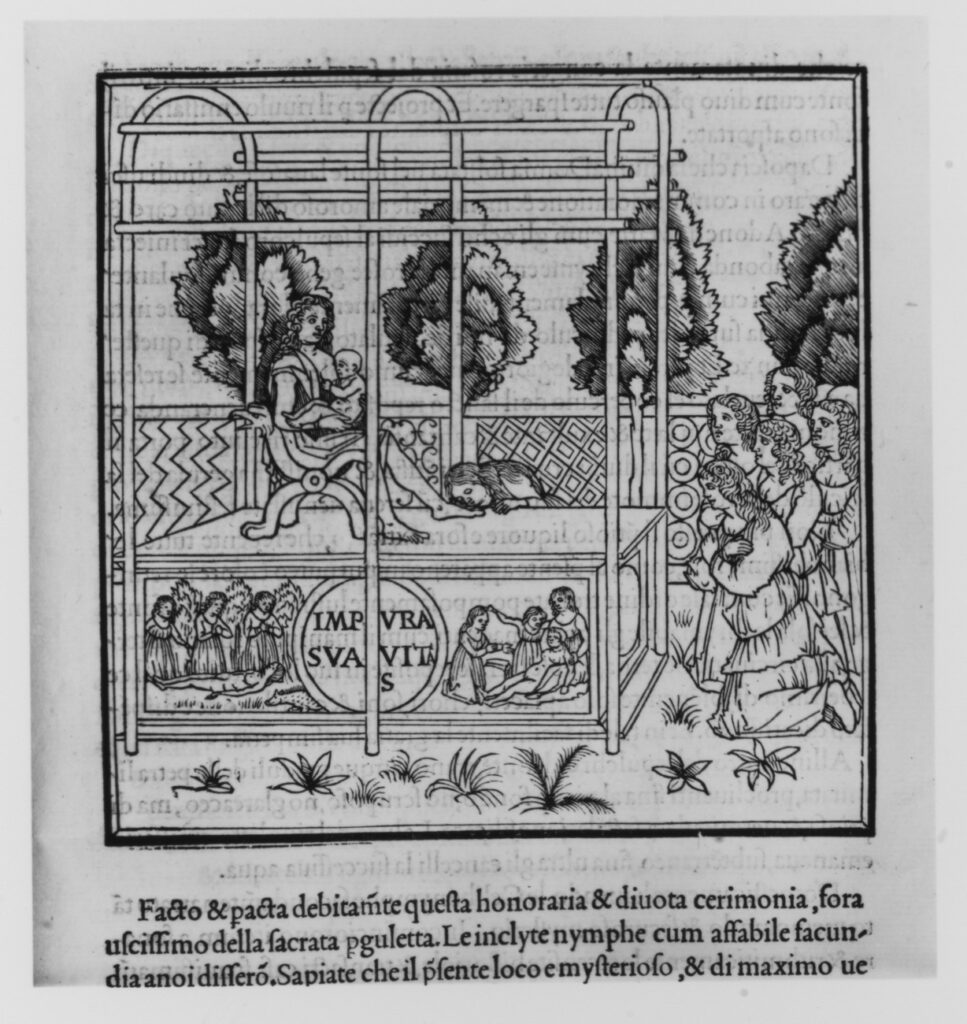
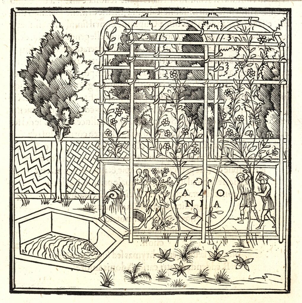
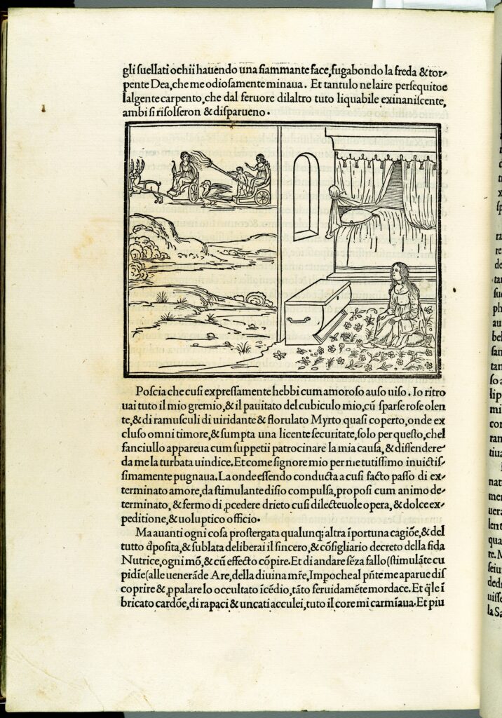
signature C7 verso
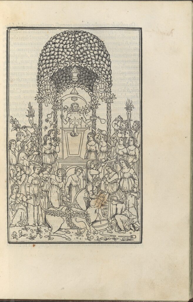
Leaf m vi recto
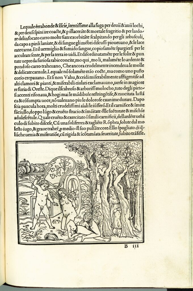
signature B3 recto (Polia’s Dream: Cupid with sword)
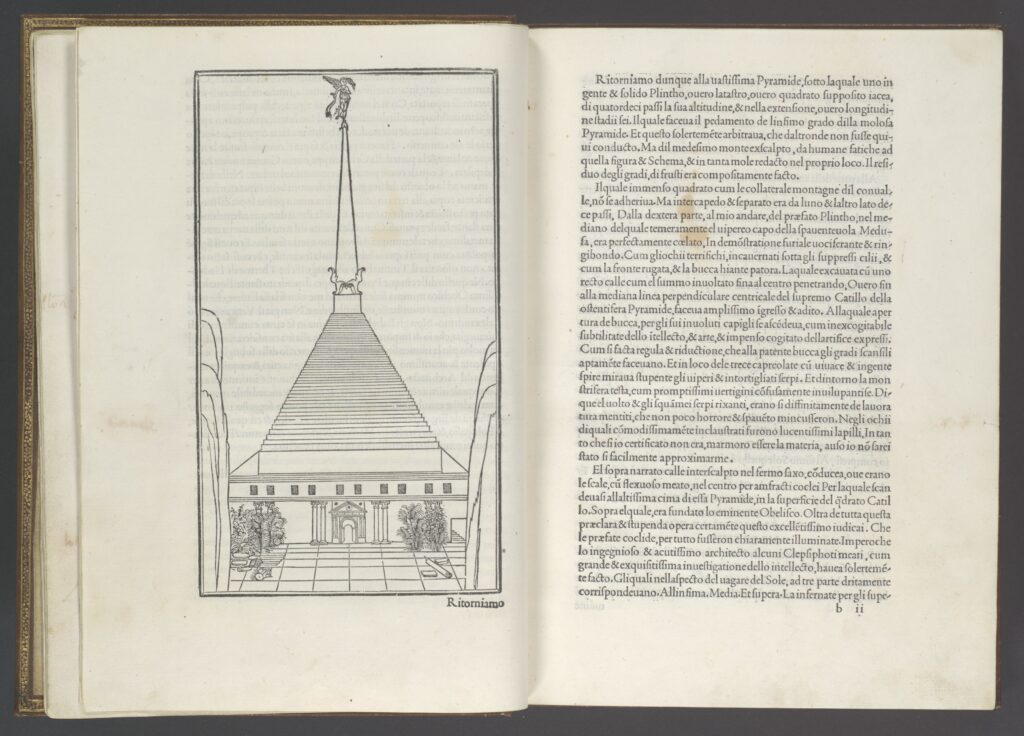
signature b1 verso and b2 recto (Marvelous temple; text)

The 1890s project at 1890s.ca.
The Yellow Nineties 2.0 magazine rack features searchable digital editions of eight late-Victorian little magazines in the context of their production and reception between 1889, when the first issue of The Dial appeared, and 1905, when the last volume of The Venture was published. The magazines are available in a number of formats. Each volume may be read in either a continuous scroll or the virtual facsimile of the flipbook. Individual items within a volume may be accessed via its hyperlinked Table of Contents. Whenever possible, promotional materials and contemporary reviews are included with each title. The Database of Ornament allows users to search and compare textual decorations across magazine titles, volumes, and contributors.
A research tool built using OMEKA software, the Y90s Database of Ornament categorizes and indexes textual ornaments in the fin-de-siècle little magazines remediated on Yellow Nineties 2.0 and establishes a standard vocabulary set for markup. Textual ornaments may be studied in Database Collections for The Dial (1889-1897), The Evergreen: A Northern Seasonal (1895-96), The Green Sheaf (1903-4), The Pageant (1896-97) and The Savoy (1896). Each digital edition on Yellow Nineties 2.0 includes an image of the decorated page, hyperlinked to the Database. Users can collect, compare, and analyze a rich visual archive of ornaments used in these little magazines, including initial letters, headpieces, tailpieces, and borders.
Editor: Lorraine Janzen Kooistra
Research Team: Reg Beatty, John Connolly, Emma Fraschetti, and Kaitlyn Fralick
Biographical essays on contributors to Y90s little magazines are written by international experts in the field and peer reviewed for publication on the site. Hyperlinked to each magazine’s Table of Contents and Introductory essays as well as to related biographies, biographical essays provide up-to-date, accessible information on the artists, authors, engravers, editors, and publishers who contributed to these magazines. Each essay is accompanied by a contemporary portrait of the biographical subject, if one is available.
For biographical details about those contributors for whom there is, as yet, no biographical essay available, go to the Y90s Personography.
The Editors welcome proposals for biographies from interested scholars. See CFP here.
Editorial Team: Reg Beatty, Koenraad Claes, Emma Fraschetti, Frederick King, Alexandra McLean, Alexandra Pospisil
A personography is a structured way of representing biographical data about a person or persons. The Y90s Personography is a searchable biographical database of the persons and publishers who contributed to the late-Victorian little magazines available on Yellow Nineties 2.0.

[The New Volumes of the Encyclopaedia Britannica constituting in combination with the existing volume of the ninth edition The Tenth Edition of that work, and also supplying a new, distinctive, and independent Library of Reference dealing with recent events and developments. The second of the new volumes, being Volume XXVI of the complete work.(Edinburgh & London, 1902, page 306]
[The text is reprinted in Charles Ricketts, Everything for Art: Selected Writings. Edited with an introduction by Nicholas Frankel. High Wycombe, The Rivendale Press, 2014, pages 113-115].
[Text printed online by Paul Van Capelleveen at charlesricketts.blogspot.com.]
Book-Printing. – The latest development in printing, in which each component of a book is controlled by a sense of harmony and beauty, owes its conception and realization to William Morris, and takes definite form in the founts and books of the Kelmscott Press. Previous efforts by Morris himself, Mr Daniel of Oxford, and others, count only as experiments towards a tasteful use of materials to hand. The great originality of the Kelmscott books lies, not merely in the order and design shown in their “build” and decoration, but in the vivifying of each part from type to paper by a high order of design and execution. Herein they differed in 1891 in all essentials, and in many new particulars, from all other modern books both in aim and aspect.
The Kelmscott Press is distinguished by the use of three founts designed by William Morris. The Troye and Chaucer founts, both of them Gothic, named after books in which they first appeared, are best fitted for ornamental mediaeval works. These books owe their chief interest to the bold handsome decoration by Mr Morris, and to woodcuts after designs by Sir Edward Burne-Jones; one of the most noteworthy examples is the “Chaucer,” of a page of which we are, by the special permission of William Morris’s trustees, enabled to give a reduced facsimile (p. 307). In Swinburne’s Atalanta in Calydon we note the partial failure of this order of type to fit the character of a modern book. In the Golden or Roman fount lie the strength and future of the Kelmscott Press as an influence on type. The Golden Type is without the exaggerated contraction of form laterally, the exaggerated use of thick and thin strokes, or the vicious stroke-terminations common to modern founts. It is a type of full body, designed in careful relation to the up-and-down strokes, and resting upon solid serifs, as with Jenson, for instance, but in detail more allied to fine penmanship or even black letter. The character of the decoration in the Kelmscott pages is stamped with the vigour which one expects from a designer of Morris’s importance. Usually on a black ground, the forms combine a northern character in thistle leaf and composite flower, with a fluency of curve comparable to the famous borders of Ratdolt of Venice.
The Vale books, often classed by writers and collectors with the Kelmscott, may be counted with them so far as they also are singular in being controlled by one designer, from the important matter of type, decoration, and illustration, to that of “build” and press-work. The first Vale book in which each of these conditions was achieved is Milton’s Minor Poems (1896). In this the Roman type, known as the Vale fount, designed by Charles Ricketts, differs from the Venetian and Kelmscott founts by a greater roundness or fulness of body, and in a modification of details by the conditions of type-making. The second fount used in the Vale issues, first employed in The Plays of Shakespeare (1896) [i.e. 1900], is less round in body, more traditional in detail, and lighter in effect. To be mentioned with the foregoing are some half-dozen books, printed by L. Pissarro in the Vale fount at his press, “The Eragny Press,” with woodcuts decorations. They are unique in the revival of printing by the occasional use of colour and gold.
No other books have hitherto combined the conditions specified of new type, woodcut decoration, original woodcuts, and personal control. Two American founts, adapted from Morris, are tentatively used by publishers. Mons. Grasset, in France, has designed an eclectic fount, but none of these can be associated with a special press or series of notable books. Recently, however, Messrs. Sanderson and Walker have recut Jenson’s fount and established the Doves Press, conspicuous for its taste and technical excellence.
A certain number of technical conditions had to be faced in the revival of printing for the first time in late years, i.e., the printing of woodcuts on hand-made paper, and the printing of borders and initials in the body of the text; both in pitch and in sustained evenness of tone the Kelmscott Press (notably in the Chaucer) remains unsurpassed. The inking-up process employed to achieve the above conditions is a very gradual one. The paper chosen for its regular thickness is, moreover, slightly damped, to avoid a gritty aspect in the blacks; hence the delicate embossed appearance of the pages, and the absence of all overloading with ink. In the manipulation of English or “Roman” vellum the consistency of the inks used is even greater, the vellum, of course, not being damped. The so-called “Roman” vellum is made at Brentford. The vellum used for the Kelmscott Chaucer was damped.
Authorities. – Articles on the revival have appeared in the Athenaeum, the Saturday Review, Magazine of Art, The Studio, and the Contemporary Review. More detailed and more accurate information will be found in A Note by William Morris on his Aims in founding the Kelmscott Press. Kelmscott Press, 1898. – Floury. De la typographie et de l’harmonie de la page imprimée. Paris. – Hacon and Ricketts, A Defence of the Revival of Printing. – See also article, Morris, William. (C.Ri.)


A Note by William Morris on His Aims in Founding the Kelmscott Press, 1898.
A note by William Morris on his aims in founding the Kelmscott Press : together with a short description of the press / by S.C. Cockerell, & an annotated list of the books printed thereat. Frontispiece by Edward Burne-Jones.
“This was the last book printed at the Klemscott Press.. It was finished at No. XIV Upper Mall, Hammersmith, In the County of London, on the Fourth Day of March, MDCCCXCVIII. Sold by the Trustees of the Late William Morris at the Kelmscott Press.” (71)
“Octavo. Golden type, with five pages in the Troy and Chaucer types. In black and red. Borders 4a and 4, and a woodcut designed by Sir E. Burne-Jones. 525 on paper at ten shillings, 12 on vellum at two guineas. Dated March 4, issued March 24, 1898. Published at the Kelmscott Press. Bound in half holland.” (59)


A Bibliography of the Books Issued by Hacon & Ricketts, 1904. Dedication: “To W.L. Hacon.” [London] : The book has been printed by the Ballantyne Press, under the supervision of C. Ricketts, who is the designer of the three founts and the decoration.
“Small quarto. Printed in red and black. With a frontispiece engraved by C. Ricketts after the sign-board painted by C. H. Shannon of the old Vale premises. Vine border. Two hundred & fifty copies on paper at fifteen shillings. Ten on vellum. Issued privately by Charles Ricketts, 1904.” (A Bibliography, xxxiv).

Title page

Page iv-v

Page xx-xxi

Page xxx-xxxi

Page xxxii-xxxiii

Page xxxiv-xxxv, showing the Vale font.

Page xxxvi-xxxvii showing the Avon Font.

Page xxxviii-xxxix showing the King’s Font.

xli – back matter.

Final printed page.

A Defence of the Revival of Printing by Charles Ricketts, 1899. From the Vale bibliography: “With woodcut by him and border (used first in ‘Epicurus, Leontion and Ternissa’) and a new firm mark designed and engraved by Charles Ricketts. Crown octavo. Two hundred and fifty copies printed at six shillings. Ten on vellum.” [Colophon: Printed at the Ballantyne Press. Decorated by C. Ricketts. Sold by Hacon & Ricketts]

A Defence of the Revival of Printing by Charles Ricketts, title page

A Defence of the Revival of Printing by Charles Ricketts, Page spread 22-23

A Defence of the Revival of Printing by Charles Ricketts, Page spread 36-37

A Defence of the Revival of Printing by Charles Ricketts, back matter

Daniel P Williford is a Special Collections Librarian in Southern California. This page collects resources for use by Special Collections Instructional Librarians.
Special Collections Libraries and Archives are usually part of University or Academic libraries but are sometimes independent.
Below is a list of resources related to Special Collections Librarianship.
Special Collections Librarianship
Special Collections Policies and Statements
Special Collections Open Educational Resources (OERs)
Critical Special Collections Librarianship

Twitter hashtag conversations: #MedievalTwitter #ShakeRace #RaceB4Race #LitPOC #BIPOC18 #Bigger6 #VicPOC #POC19 #blackintheivory #RBSBlackPrintCulture #RBSOnline #CiteBlackWomenInLIS #CritArch
“The inaugural RaceB4Race conference emerged as a collaboration between the Medievalists of Color (MOC) and the ShakeRace (Shakespeare and Race) community, groups that were both seeking to push their fields in new archival, theoretical, methodological, pedagogical, and practical directions….In the end, the inaugural RaceB4Race event demonstrated to the world how our understandings of periodization, historicity and even academic disciplines can become more expansive once race is acknowledged as a viable lens of investigation.”
“We are literary and cultural critics whose commitment to anti-racist and anti-colonial politics grounds our study of the global 18th and 19th centuries and their long (after)lives. We endeavor to effect structural changes in our discipline and institutions by promoting scholarly and creative work by historically marginalized people, those excluded from the Romantic canon, and those excluded from the field of Romanticism.”
Kimberly Anne Coles, Kim F. Hall, and Ayanna Thompson. “BlacKKKShakespearean: A Call to Action for Medieval and Early Modern Studies.” MLA Profession. https://profession.mla.org/blackkkshakespearean-a-call-to-action-for-medieval-and-early-modern-studies/
“With immense pain, scholars of medieval and early modern literature, history, and culture have had to acknowledge that our fields of study are not politically neutral. The colonial project is stitched in and through the language and literatures of the pre- and early modern periods; the politics and economics that ultimately produced settler colonialism, chattel slavery, the forced migration of peoples, and the development of the British empire animate these early English texts. If more faculty members do not confront this history, we may actually be aiding those whose political, cultural, and social beliefs many of us find personally abhorrent and intellectually bankrupt.”
M. Rambaran-Olm. “Anglo-Saxon Studies [Early English Studies], Academia and White Supremacy.” Medium.com, June 27, 2018. https://medium.com/@mrambaranolm/anglo-saxon-studies-academia-and-white-supremacy-17c87b360bf3
“Early English studies implies white, traditional and conservative and its current stars in the field often champion this representation. The field will not remedy itself if, at its core, it attracts white supremacists and/or continues to reject people from marginalized communities that offer new possibilities and promise to a dying field. Altogether, a more diverse set of scholars specializing in early medieval England would be more likely to explore ‘different’ angles, and other stories like them; thus broadening our understanding of the period in the process.”
Brandy C. Williams. “On Building a #ShakeRace ‘Canon.’” Brandycwilliams.com, January 18, 2020. https://www.brandycwilliams.com/blog/on-building-a-shakerace-canon
Downloadable syllabus, “#ShakeRace: An Introductory Guide.” “Since this conversation is dominated by scholars who teach, it only makes sense to turn our attention to our pedagogy and ask how we are teaching these works and how we should be teaching these works, given the present state of the field and the world. That’s why I elected to generate a syllabus. As a student, the syllabus is my guideline, my starting place, but not my end-all-be-all for a course. Likewise, the #ShakeRace Syllabus should be viewed in the same way. This guide proposes general frameworks of progression for thinking about Early Modern Critical Race Studies with specific attention to Shakespeare. My goal is to invite as many collaborators as possible to crowdsource the growth of the document, including objects beyond scholarly articles and monographs—things like performances, public humanities projects like the Qualities of Mercy project, and others. This is a public document that I hope will serve as a mini-archive and starting point for anyone interested in Early Modern Critical Race Studies, recognizing our past, our present, and our future.”
Ruben Espinosa. “A Darker Shade of Shakespeare.” Shakespeare’s Globe, August 23, 2020. https://www.shakespearesglobe.com/discover/blogs-and-features/2020/08/23/a-darker-shade-of-shakespeare/
“What we have witnessed in the act of kneeling, when it is on the neck of a Black man, is our racist, violent history and the deep danger and absolute monstrosity of elevating whiteness. In my corner of the world, brown children are separated from their families at the border and caged in for-profit detention centers. What, you might ask, do these racist realities have to do with Shakespeare? Well, if the likes of Johnson can claim him to promote white supremacy (that is, the perpetuation of systems that benefit white people at the expense of people of color), perhaps we can use him to pursue anti-racist efforts. Johnson’s version of Shakespeare is tired, old, and white. This darker shade of Shakespeare that is emerging is so much more vibrant, so much more powerful, and full of the potential for change.”
Ronjaunee Chatterjee, Alicia Mireles Christoff, Amy R. Wong. “Undisciplining Victorian Studies.” LA Review of Books, July 10, 2020. https://lareviewofbooks.org/article/undisciplining-victorian-studies/
This essay challenges the racism that undergirds Victorian Studies and maintains it, demographically, as an almost entirely white field. Victorian Studies (VS), which examines the literature and culture of Britain in the period roughly defined by Queen Victoria’s reign (1837–1901), a period concurrent with the heyday of the British Empire, stands in a special position: it is one of the most enduring bastions of the fantasy of an unmarked universality. By this we mean it is emblematic of a broader ideological effort to demarcate the “racial” from the “nonracial” (as if such a category could exist).