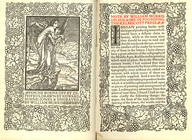
Samples and captions by digital libraries uc edu.
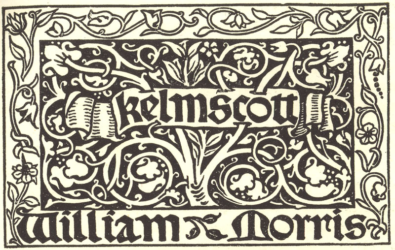
William Morris’s printers mark, this appeared in nearly all of the books published at Kelmscott
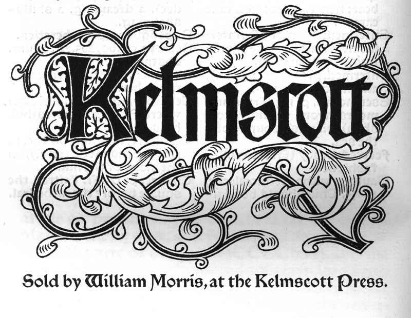
A later printers mark, used on large folio format books
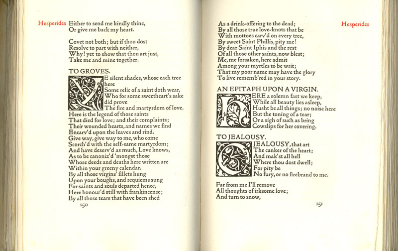
A spread from ‘Poems Chosen out of the Works of Robert Herrick
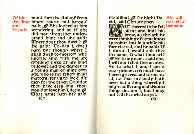
A spread from ‘Child Christopher and Goldilind the Fair’, Kelmscott Press, 1895

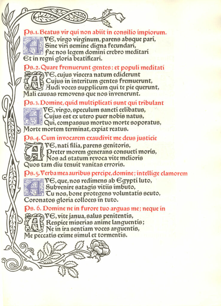
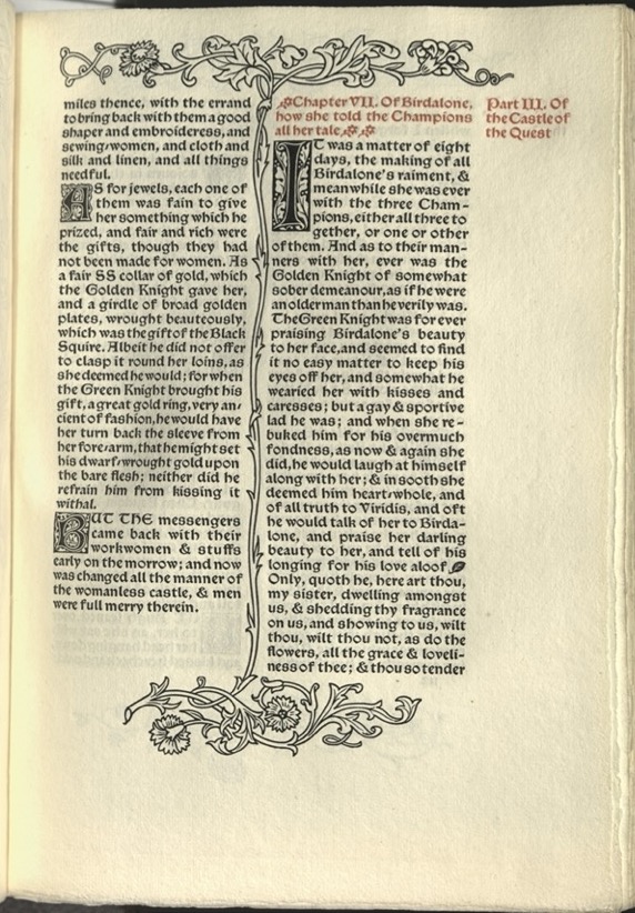
An instance where red is used to provide emphasis on words in the text, instead of only for subtitles and headings
A page from ‘Laudes Beatae Mariae Virginis’ – which is very rare among Morris’s works that is uses blue ink in addition to the typical black and red.
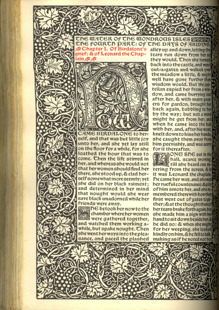
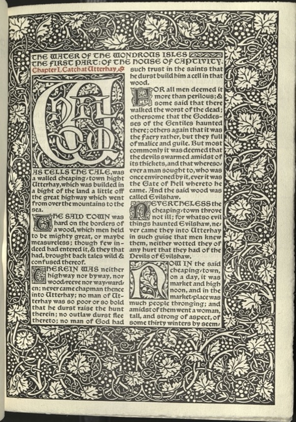
The first page of the Waters of the Wondrous Isles’
A title page from ‘The Boke of Cupid’ with an exceptionaly large illuminated word – ‘the’
The cover of ‘Art and its Producers, and the Arts & Crafts of Today: Two Addresses Delivered Before the National Association for the Advancement of Art. By William Morris
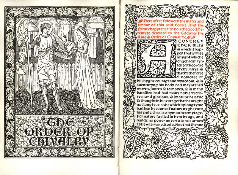
The title spread of ‘The Order of Chivalry’, printed on vellum
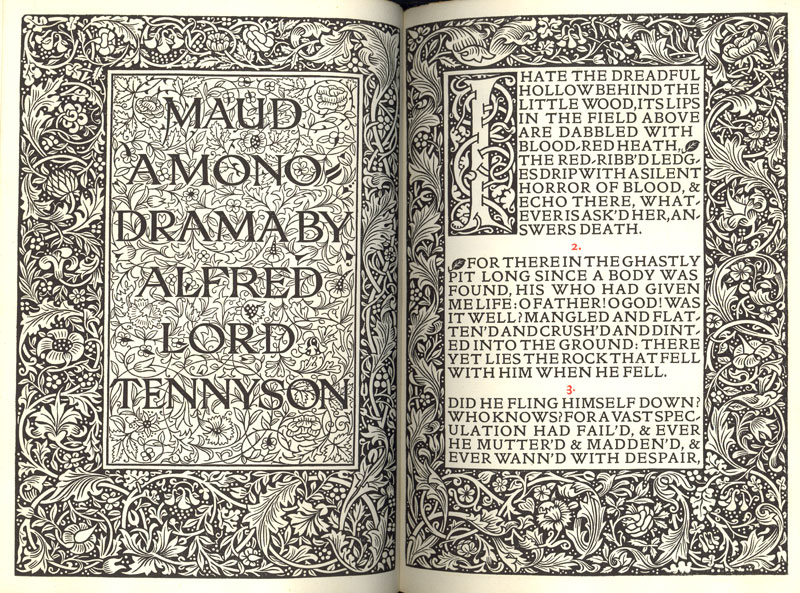
The title page spread from Alfred Lord Tennyson’s ‘Maud’
This was the last book printed at the Kelmscott Press, and was sold by the trustees of William Morris
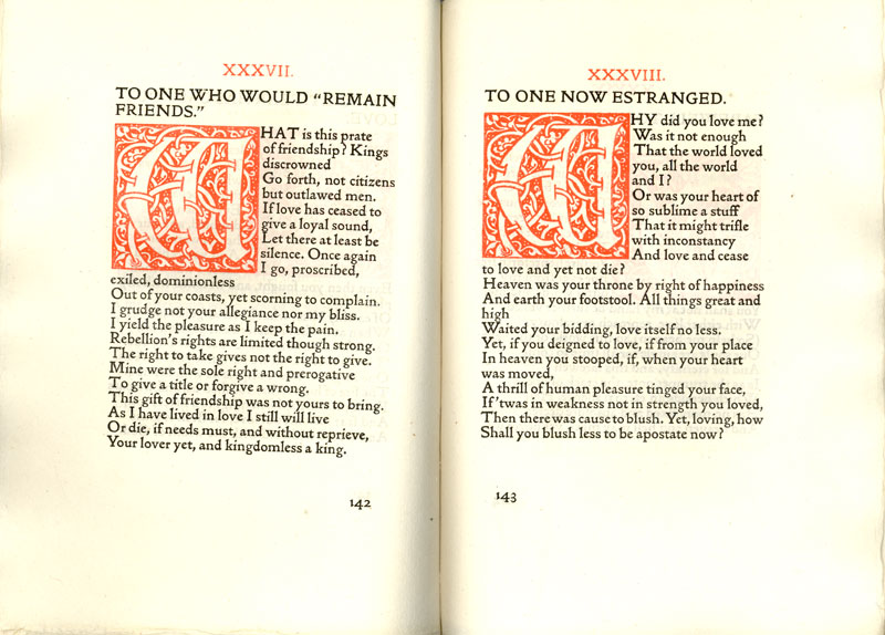
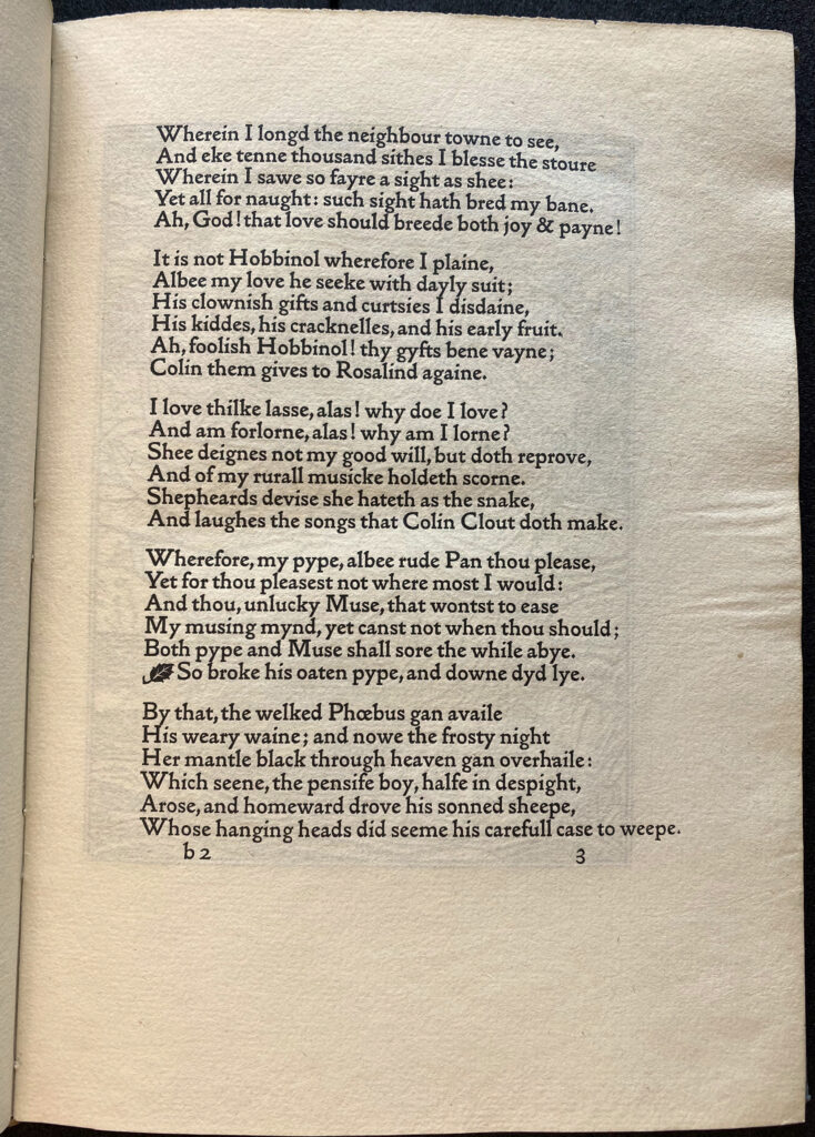
Two poems from ‘The Love-Lyrics and Songs of Proteus’. This layout is rare because it uses red illuminates characters

Typographic samples of the three fonts William Morris designed and used at Kelmscott
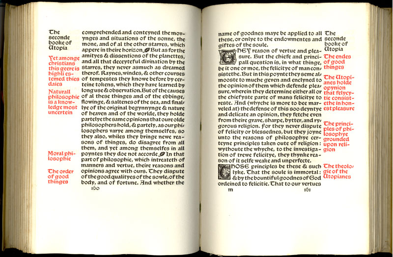
A spread from More’s ‘Utopia’. In this case the red margin notes summarize the corresponding text
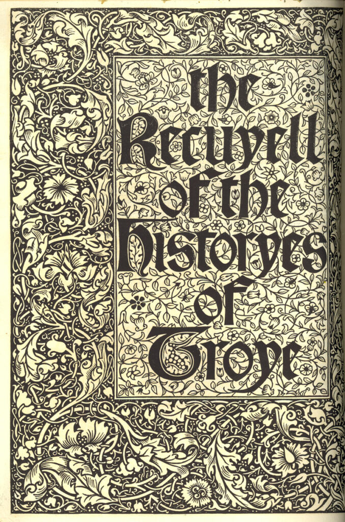
Title page from ‘The Recuyell of the Histories of Troye’
From “Kelmscott Press and Victorian Medievalism,” Arizona State University.
Kelmscott Press and Victorian Medievalism: An Online Exhibit of the Kelmscott Press was curated by Karina Wilhelm and Jacob Robertson. Emil Smith and Alexa Nino assisted them, selecting images and writing portions of the text.
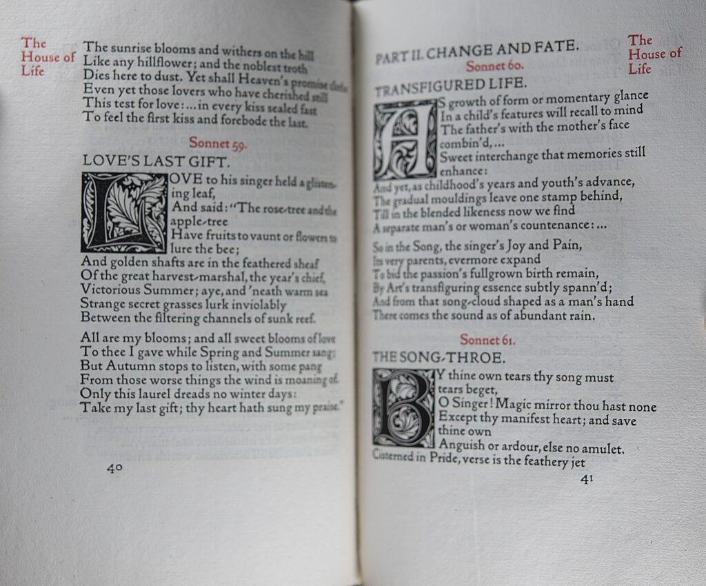
Sonnets and Lyrical Poems, PRB-486
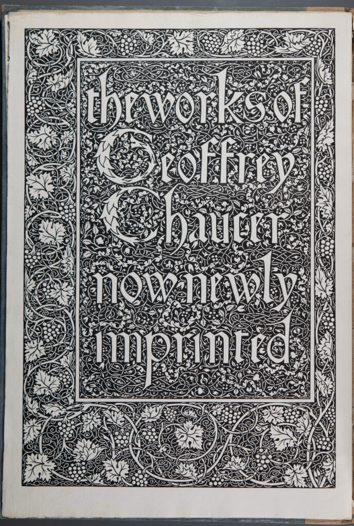
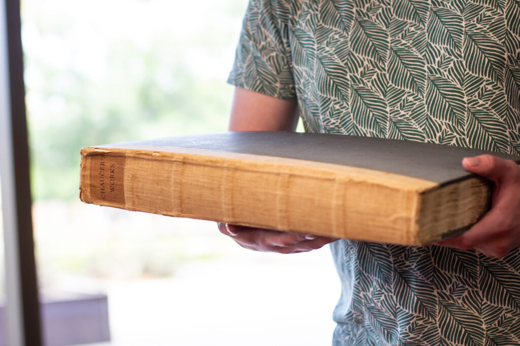
Works of Geoffrey Chaucer, SPEC B-737
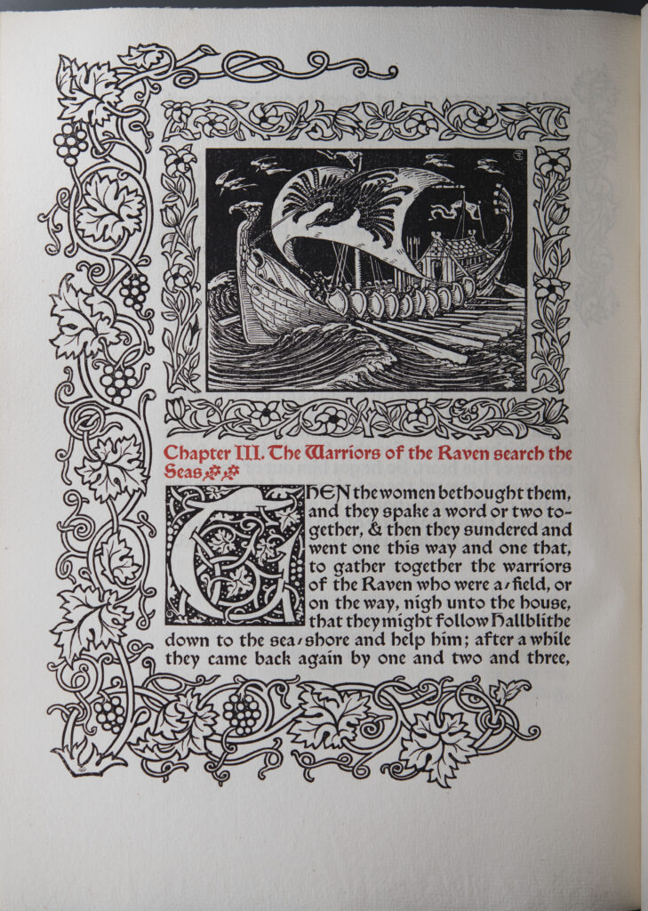
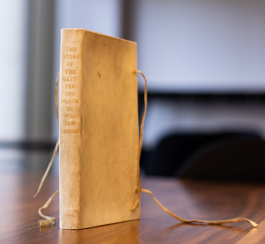
Story of Glittering Plain, PRBF-34
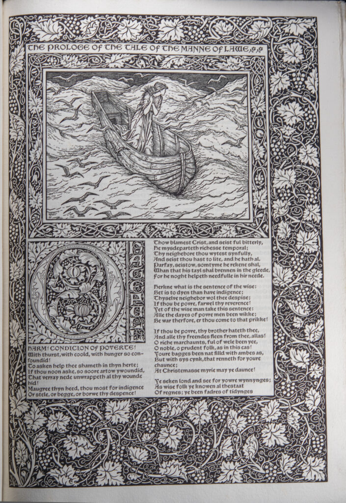
Works of Geoffrey Chaucer, Mann of Lawe , SPEC B-737
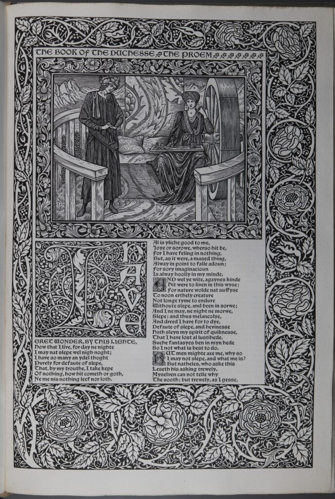
Works of Geoffrey Chaucer, 385, SPEC B-737
Works of Geoffrey Chaucer, 60, SPEC B-737
Flower, Glittering Plain, PRB-463
Apple, Story of Sigurd the Volsung, PRBF-41
Perch, Works of Geoffrey Chaucer, SPEC B-737
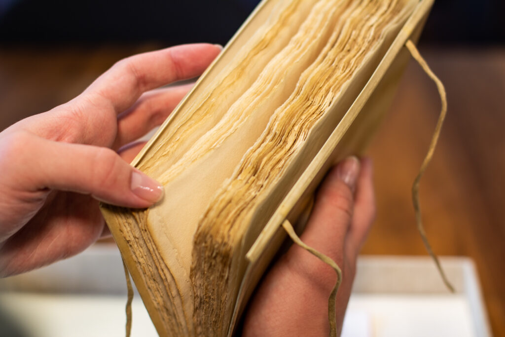
Most Kelmscott Press books were printed on handmade paper produced by Joseph Batchelor and Son in Kent. Morris specified that the paper had to be made of linen rags. In his note about the founding of Kelmscott Press, Morris also specified that a mould must be used, which would produce a ribbed appearance similar to the paper he had identified as his model, paper produced in Bologna around 1473.
Morris also printed a limited number of copies of each publication on vellum. He sought high-quality, Italian vellum, but because he was competing with the Vatican for that supply, he found locally produced vellum that met his standards, produced by Henry Band and William J. Turney & Company.
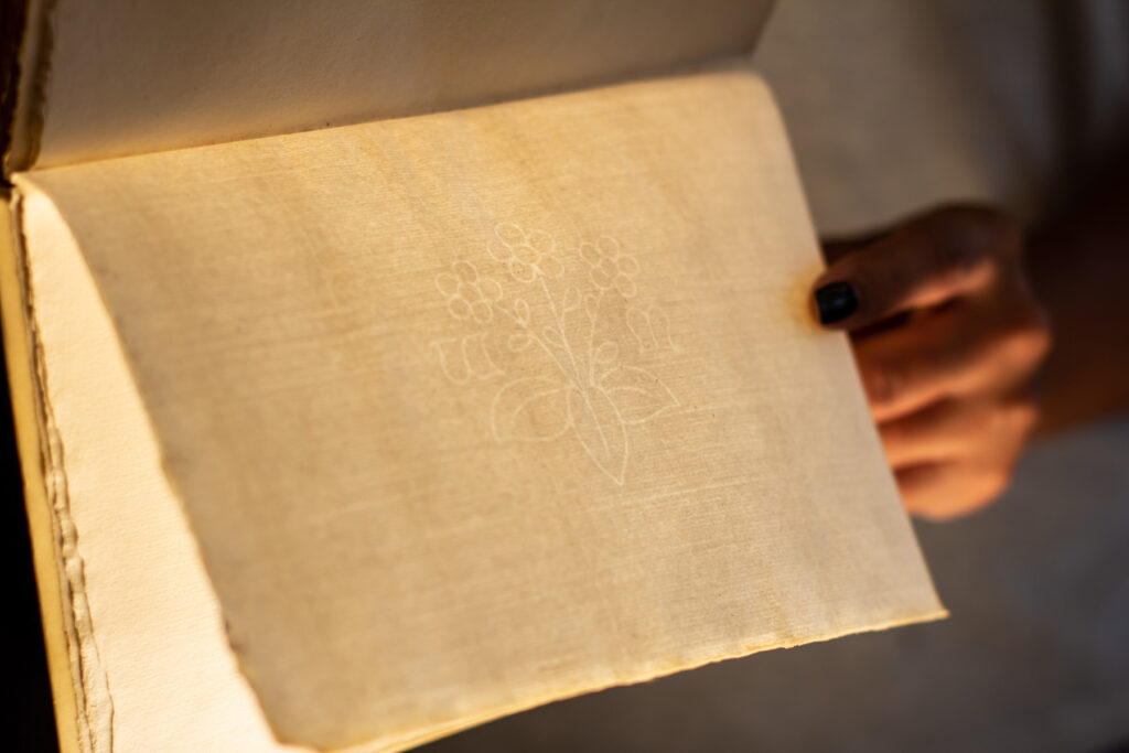
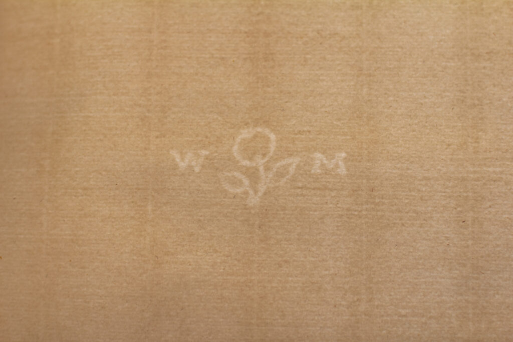
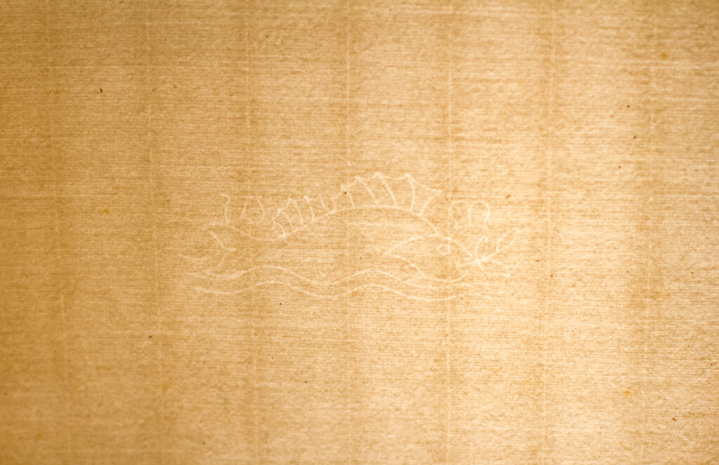
Another feature of the papers used for the Kelmscott Press books were watermarks. Morris designed three watermarks–a flower (primrose), perch, and apple. The flower appear in 16″ x 11″ and 16″ x 22″ paper; the perch in 17″ x 23″ paper; and the apple watermark in 18″ X 13″ paper.
Golden typeface, Shepheardes Calendar, PRB-506
According to Morris, he began with a Roman type. He considered the letters to be pure in form and free of “needless excrescences.” His inspiration for his “Golden” typeface (left) was the French engraver, Nicholas Jensen, who worked in Venice and designed the most complete set of Roman font
Troy typeface, Floure and the Leafe, PRB-505
Chaucer typeface, Sir Degrevaunt, PRB-508
Morris then developed a Gothic typeface that was as easy to read as Roman type. This was his “Troy” typeface, but as he undertook the work for his Chaucer, he needed a smaller version to accommodate the double-column format. To fill this need, he designed the aptly named “Chaucer” typeface.
In addition to having well-designed, easy-to-read typefaces, the color of the text when printed was important to Morris. He disliked that many Victorian publications looked grey due to the cheap ink used. To avoid this, Morris sought a very black ink and found one produced by Gebrüder Jänecke in Hanover, Germany.
Having selected paper, typefaces, and ink, Morris and the Kelmscott Press used Albion hand presses to print their publications. Kelmscott’s Chaucer posed particular challenges due to its size so Morris acquired a third Albion press, an Albion Press no. 6551. The Floor Model Albion Press No. 6551 Morris used now resides at in the Cary Graphic Arts Collections at the Rochester Institute of Technology.
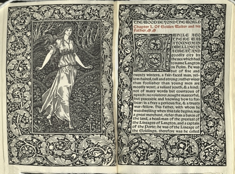
Heroine, Wood Beyond the World, PRB-203

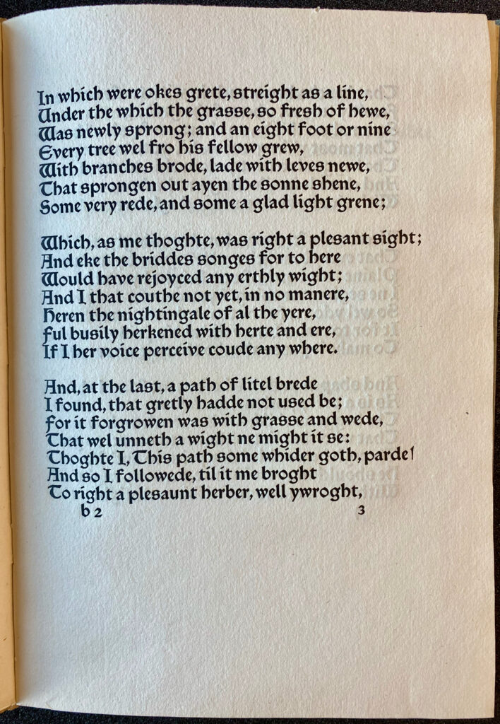
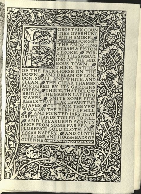
Water of the Wondrous Isles, PRB-39
Water of the Wondrous Isles, PRB-39
Water of the Wondrous Isles, PRB-39
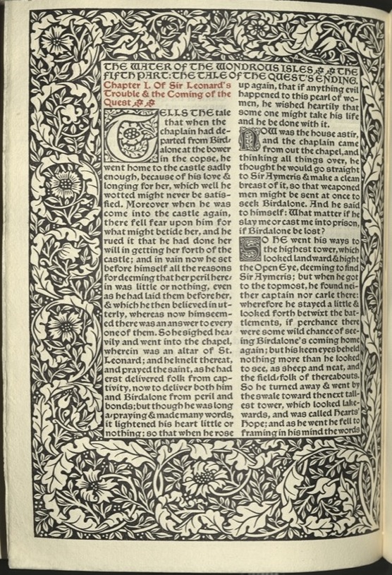
Water of the Wondrous Isles, PRB-39
Earthly Paradise, PRB-503

Opening, Works of Geoffrey Chaucer, SPEC B-737
Opening, Works of Geoffrey Chaucer, SPEC B-737
Graphic Design and Visual Culture in Europe 1890-1945: Private Press Books in Special Collections, the University of Glasgow Library.
frontispiece from The Well at the World’s End
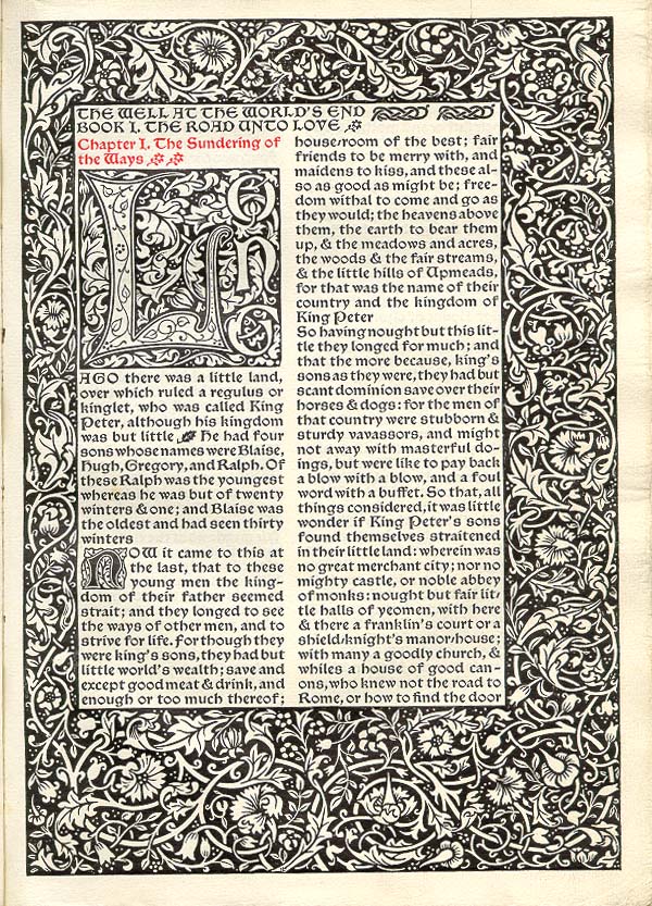
opening of The Well at the World’s End
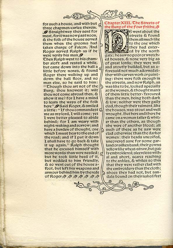
page of text from The Well at the World’s End
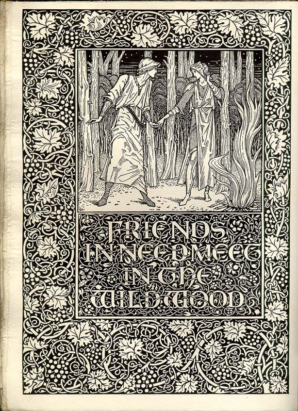
frontispiece to Book III of The Well at the World’s End
colophon of The Well at the World’s End
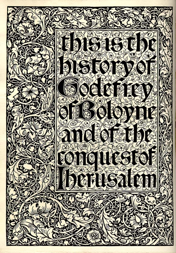
frontispiece title-page from The History of Godefrey of Boloyne
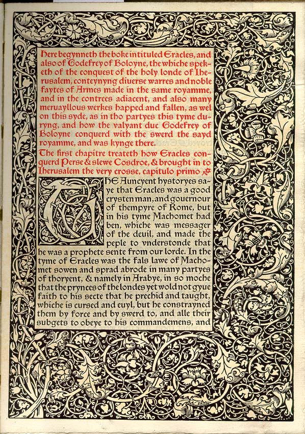
opening from The History of Godefrey of Boulogne
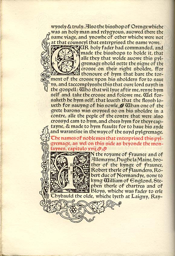
page of text from The History of Godefrey of Boloyne
pages of text from Gothic Architecture
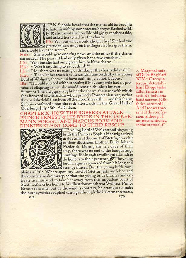
page of text from Sidonia the Sorceress
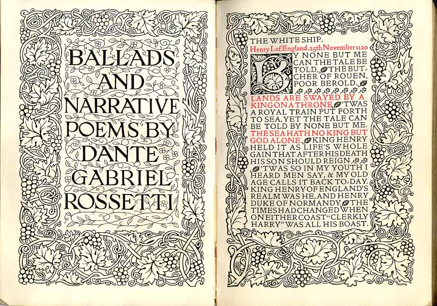
title-page & opening from Rossetti’s Ballads and Narrative Poems
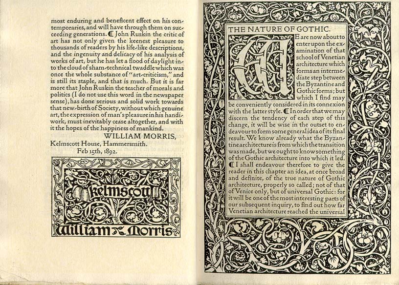
end of preface and opening of The Nature of Gothic